Those wonderful boffins at Akzo Nobel and Dulux have been working hard to discover what our passions are in colour and have declared ‘Copper Blush’ as the Colour of the Year for 2015. A warm, inviting colour that picks up the orange hues in the metal of the moment, copper, they say: “Copper Blush is a perfect take on this metallic trend, but adopting a chalkier, cooler finish than the metallic family, the colour really comes alive when combined with pink, clay toned neutrals, crisp white as well as shimmering metallics.”
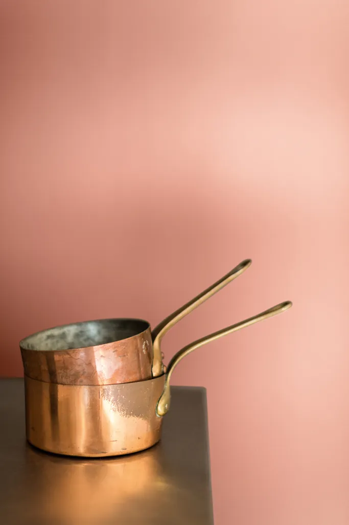
The ironic thing for me is that while I initially wasn’t thrilled about this choice – as much as I love my warm metallics – I have found myself recently looking for the perfect shade of chalky pink-orange for a room makeover I’m planning. And well, copper blush isn’t actually that far away from what I’m looking for. So perhaps Dulux is actually pretty spot on with their choice this year.
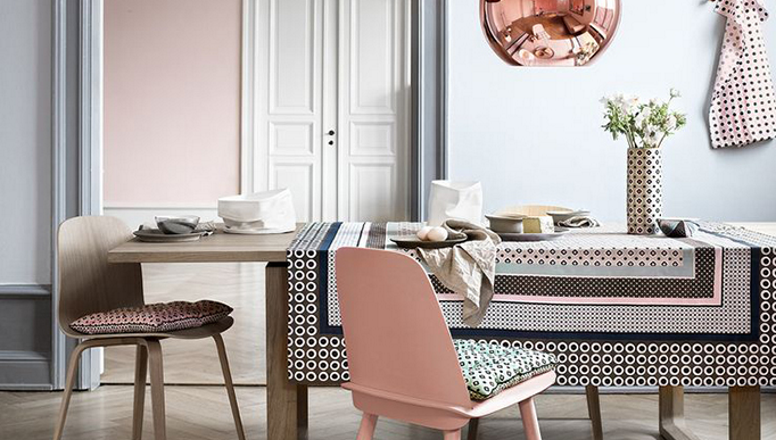
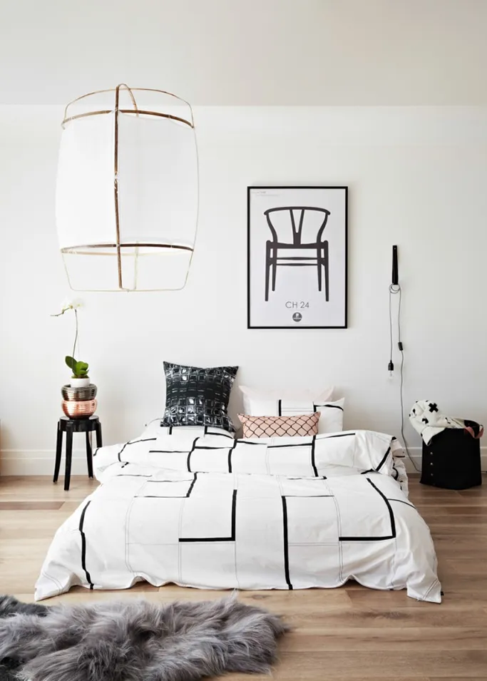
I admit, I think it looks best when combined with pale blush pink, greys and white – not overtly feminine but calming and serene and certainly a palette that would look wonderful anywhere you chose to use it.
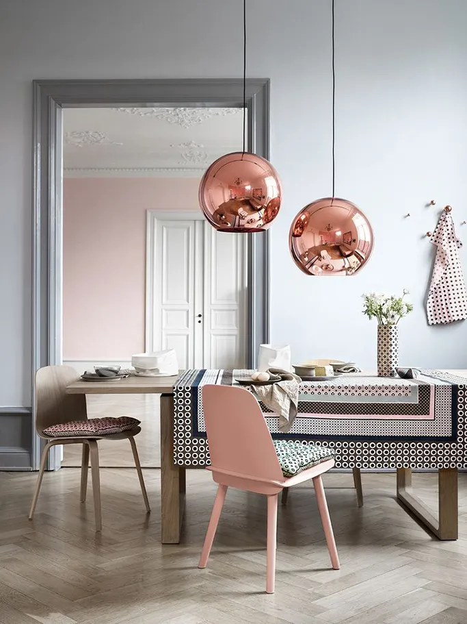
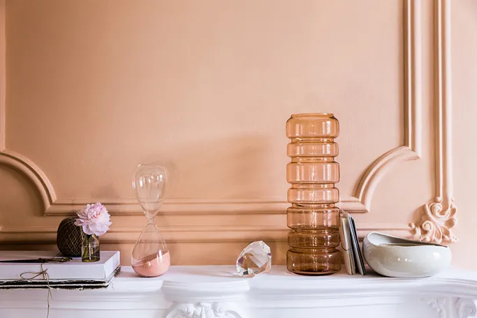
Of course, if you are resistant to painting an entire wall in this blushy hue, then perhaps a few simple accessories paired with metallic copper is the easiest way to adopt this trend.
Love this look? Here’s a few ideas to help you pull a Copper Blush palette into your home.
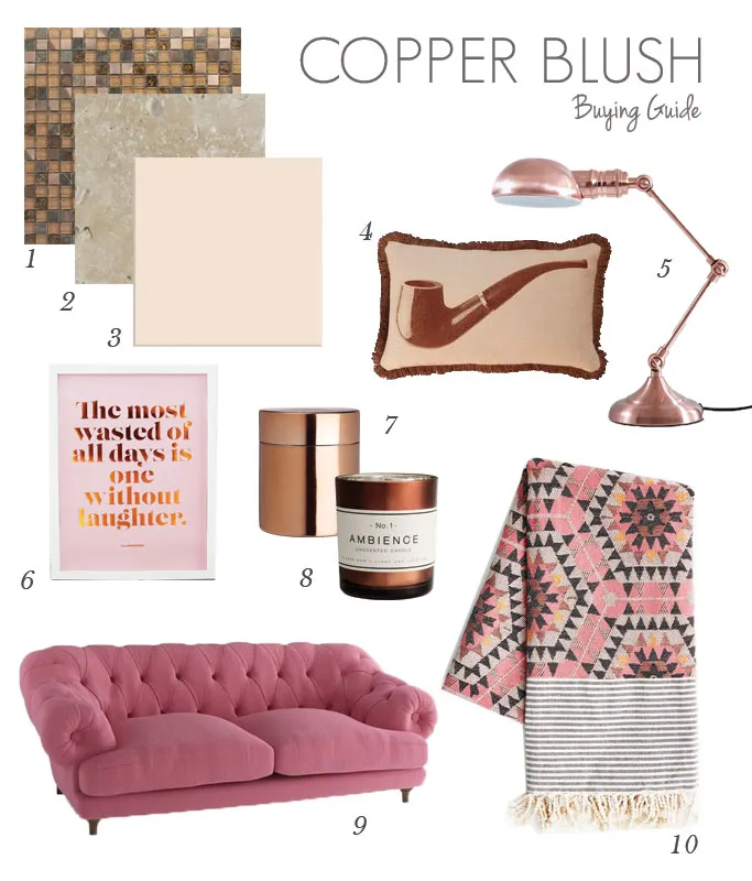
1 – Andes Glass Mosaic Tile / 2 – Tumbled White Travertine Tile / 3 – Prismatics Peach Sorbet Gloss Wall Tile / 4 – Smokin Cushion / 5 – Copper Task Lamp / 6 – Laughter Copper Foil Print / 7 – Lidded Jar / 8 – Copper candle / 9 – Bagsy Sofa in Pink / 10 – Honeycomb throw
Is Copper Blush a colour you’ll be using in your home this year? I’d love to hear from you in the comments!
Image sources: Dulux / Muuto / Norsu Interiors via Decor Dots
As a multi-award winning interior design content creator, Kimberly Duran is an Interior Design-obsessed American ex-pat, who chronicles her decorating journey and dispenses interior design advice in her personal blog, Swoon Worthy. When she’s not helplessly drooling over all the latest trends in design, she’s adding things to the imaginary ‘shopping basket’ in her head, she likes to get messy tackling DIY projects with her partner in crime, Wayne, stalking eBay for vintage bargains and filling her home with her favourite neutral – gold.
[…] on Tile Mountain, I talked about Dulux’s Colour of the Year Copper Blush. Admittedly, I think it’s a much better choice than murky Marsala. My preference is to […]
[…] “Our research saw gold and gold tones being used everywhere in the design world. It is a recurring colour at design fairs and in graphic design as well as in architecture, fashion, beauty and interior decorating. We feel that this is a beautiful next step, a natural evolution and transition from the coppery orange that was the Colour of the Year for 2015.” (Check out our inspiring post on last year’s colour of the year, Copper Blush.) […]