It’s Colour of the Year time again, and so we’re taking a closer look at Brave Ground from Dulux for 2021. There will be more to follow around this annual style talking point in the coming weeks, (and we will endeavour to keep you updated as the latest colour news is delivered), but until then, let’s take a deep dive into Dulux Colour of The Year 2021…
In Neutral Gear
Brave Ground is described by the Dulux team as a warm, natural neutral; ‘Every year, our colour specialists, plus a team of top international design experts discuss the latest global trends that will affect every area of our lives. We then translate these insights into one key colour that reflects the mood of the moment – a tone that’s set to have an impact on homes all over the world.’
‘What has emerged from our trend forecast this year is that we’re all reassessing what really matters in our lives. We’re taking stock and finding a new and positive way forward by having faith in ourselves, working together, building on the past and planning for the future – it takes courage to embrace change and our homes can help provide a solid and supportive foundation, as well as giving us the scope to be creative.’
It all sounds wonderfully warm, positive and appealing, and indeed, it’s a very good colour to blend with the natural tones of many of our tiles, so we have to agree that Brave Ground gets an uptick from the Tile Mountain team…
Subtle Variations
If you’re diving straight in with a Brave Ground-based colour scheme for perhaps the kitchen or bathroom, take a look at our Craquele crackle-glazed wall tiles, shown here in a random mix of Grey, Cream and White. There are a couple of other shades available, all of which would blend admirably with a Brave Ground-style scheme – Bone, Olive, Mint, Fresco and Dove. A very acceptable way of creating a softer, soothing colour scheme that has a gentle, warming feel.
Surface Style
The virtual launch of the new Silestone Colours by Cosentino took place a few weeks ago – this is Camden from the Loft Collection. This particular shade was designed to capture the essence of the neighbourhood, inspired by rusty tones and steely shades. It’s a soft, delicate, homogenous grey, with a fine grain and subtle white veining. And, here at Tile Mountain you’ll find lots of floor tiles in our collections which will compliment this acrylic surface. The surface itself is a hybrid formula, HybriQ+, made from minerals and recycled glass, and contains a minimum of 20% recycled materials – depending on the colour, some of the surfaces contain up to 60% recycled materials. The actual production process is carried out using 98% recycled water and 100% renewable energy.
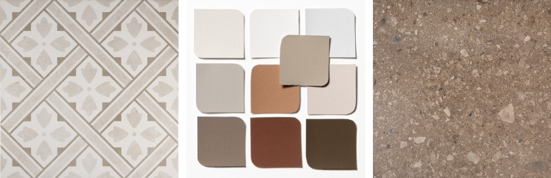
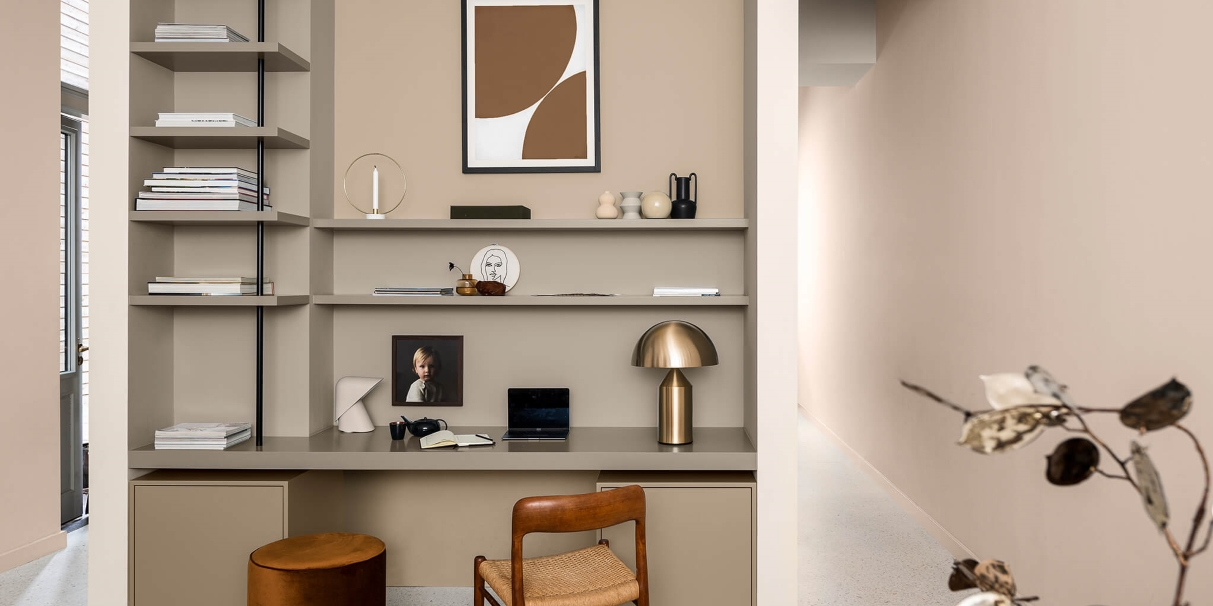
Mr Jones in Cream by Tile Mountain | Brave Ground Themes from Dulux | Terrazzo Mix Beige by Tile Mountain
All Square
We can’t resist offering a little more inspiration for edging-towards-brown-and-beige colour schemes. After seemingly endless grey schemes, these warmer tones are beginning to appeal more and more. It’s a delicate balance though, and one that can be improved by the odd touch of bright colour; think warm rust, terracotta or orange. From left; Our very own Mr Jones in Cream patterned wall and floor tiles. Just right for halls, porches and utilities as well as kitchens and bathrooms. Next, more options and additions to a Brave Ground theme, from Dulux. And lastly, our Terrazzo Mix porcelain wall and floor tiles in Beige, which are such a perfect shade for a neutral scheme that will continue to look fashionable and sophisticated for many years to come.
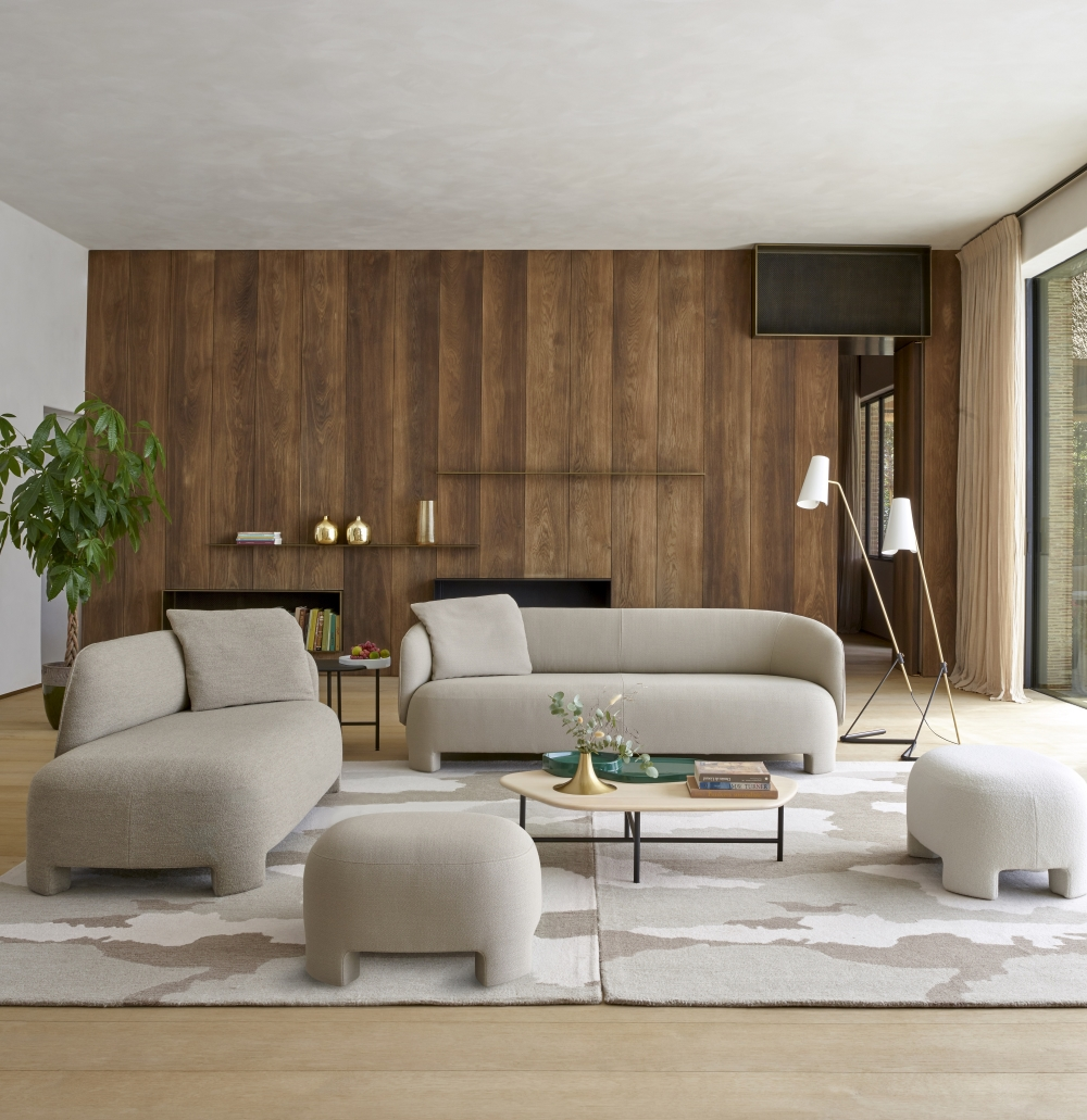
Naturally Comfortable
We can’t resist a look at the super-comfy upholstery from Ligne Roset; this is the latest Taru collection, which comprises medium and large sofas, one-arm-sofa (left or right armed) and footstools. One of the concepts of the design is that it looks as good from the front as the back, so it’s an excellent concept for large, open plan spaces. And needless to say, we have a couple of suggestions for co-ordinating floor and wall tiles; for timber-style wall planks, try our Nordic Porcelain Wood Effect Wall and Floor Tiles, and for a soft colour for floor tiles, try our Graziella Wood Effect Walland Floor Tiles, in large format 1200mm x 230mm size.
Time for Texture
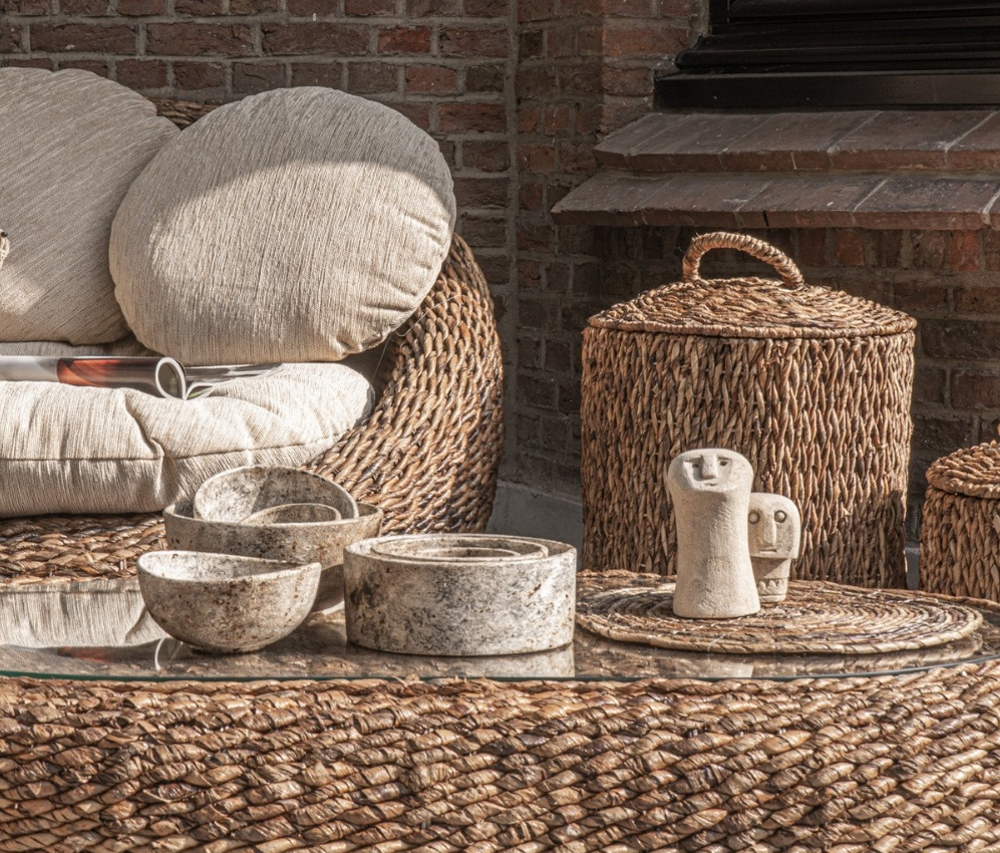
Yes, we agree that lots of neutral beige shades could look rather tepid if used together, which is why we’re suggestion that you always include textured items within your natural schemes. Think of chunky wool rugs, lovely fluffy or furry throws, plus heavy linens with bobble trims and braids. Look at the range of Banana Leaf furniture ideas from House of Flora. Their vases and planters are gorgeous too – plenty of choice for textured additions to the home …
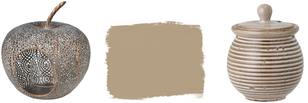
Filigree Apple Lantern by Ella James | Chalk Paint in French Linen by Anna Sloane | Bloomingville Ceramic Jar by Cuckooland
Three Stylin’
For natural, textured style, the Filigree Apple Lantern from Ella James is a great little investment; it’s made from iron with an antique brass finish, and is 26cm tall. Expand your interior paint repertoire with Annie Sloan Chalk Paint in French Linen, a very subtle neutral that can be used on all sorts of surfaces, including walls and furniture – could be just the job to expand and update your neutral interior style. And lastly, for just a small hint of neutral colour and texture, try the Bloomingville Ceramic Jar with Lid from Cuckooland (and it might be something to add to the Xmas gift list too).
It’s That Time of Year…
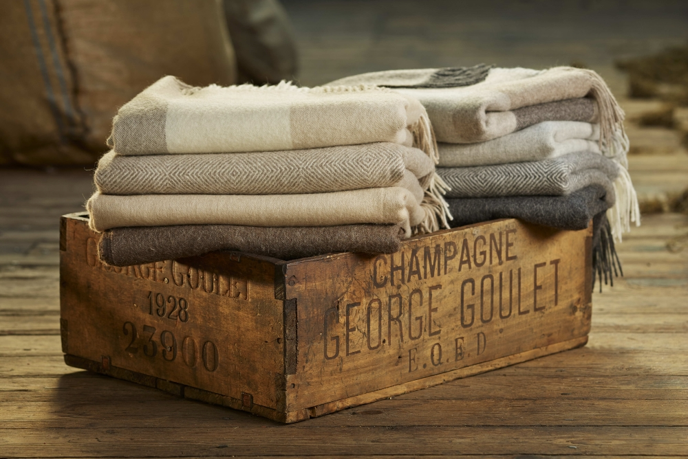
Yes it’s definitely that time of year when we all feel the need to batten down the hatches, finish up any outdoor projects that are on the go, and settle the home down in preparation for a long stretch of gloomy dark days. So in true Trend Watch style we thought we should suggest a selection of snuggly alpaca blankets that will not only bring joy to cold days and evenings, but which are bang on trend too. So here they are…Alpaca Throws in cosy shades, from Annabel James.
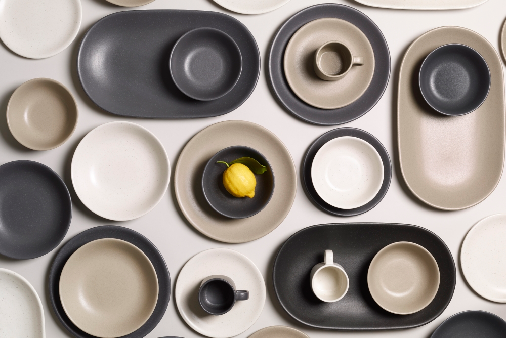
And Finally…we had to bring you news of a new tableware brand, called Monoware, created in collaboration with ceramics designer Ian McIntyre. The stoneware collection is timeless and available in neutral shades, with shapes including a pitcher, grain and cereal bowls, dinner and side plates and very useful serving platter. We can see these becoming classic and collectable!
As always, we would love to see your latest projects, especially ones that look to incorporate Brave Ground-inspired colourschemes! Hit us up on twitter @TileMountainUK, Facebook or tag us on Instagram with your pics!
You might also like these posts on the Tile Mountain blog…
Linda has worked as a freelance interiors writer and blogger for many years; she has written for most of the major home and design magazines, including KBB Magazine, Grand Designs, Homes & Gardens, House Beautiful, Period Homes and Good Homes. She made the break and moved from London back to her home town of Shrewsbury three years ago and has just finished renovating her house. She also works in an interior design studio, produces copy for brochures and website, tries to tame her garden, aims to finish all the home furnishing projects she has on the go … and loves walking.