The colour experts at Dulux have chosen Bright Skies as Colour of the Year 2022. It’s described as a light, airy and optimistic blue that’s good for the soul. And here at Tile Mountain HQ, we agree absolutely – so this month we’re bringing you some Bright Skies™ inspiration for your next interior projects!
Bright Skies & Greenery
Here, Bright Skies looks perfectly at home with the colours of nature. This is the 19th year that Dulux has gathered experts and leaders from the worlds of design, fashion, colour and the built environment to consider trends that have an impact on the way we live and work. The group met online on this occasion and the result of those discussions was the choice of Bright Skies™.
Creative Director of Dulux UK, Marianne Shillingford, says: “People want to feel revitalised and enjoy the freedoms that are returning to them, to look out and bring in new ideas. What better inspiration can we take than the endless skies around us? It is widely known that nature makes us feel better and taking steps to bring the outside in enhances our sense of wellbeing. So, whether we are working or relaxing, creating or exercising, it is essential to have a space that reflects the optimism and desire for a fresh, new start that is top of the agenda for the year ahead.
“However, Bright Skies™ is not about idle daydreaming. It is about turning those dreams into reality and forging ahead with the changes that we want to make. This is why the Dulux Colour of the Year 2022, and its supporting palettes are practical, open and flexible to all kinds of requirements. Bright Skies™ is supported by four colour palettes, to inspire and facilitate decorating projects in every kind of room – they are Greenhouse, Salon, Studio and Workshop”.
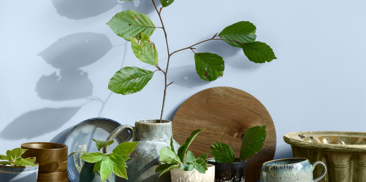
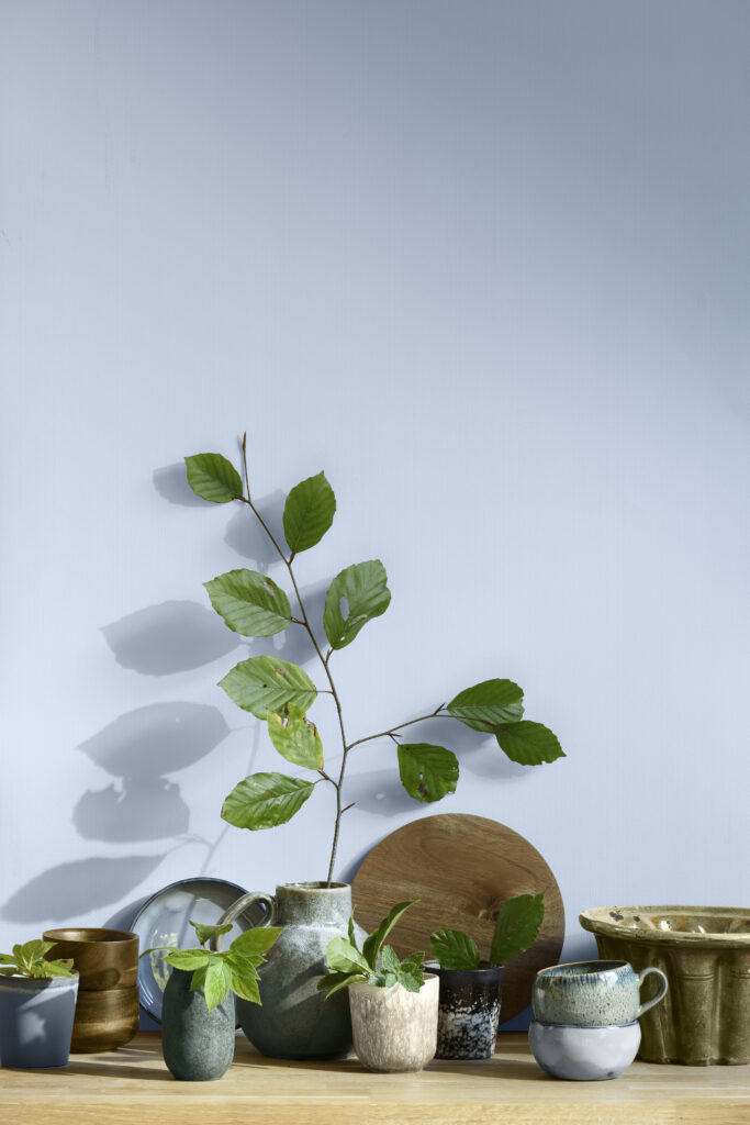
The Greenhouse Palette
Marianne Shillingford continues: “The Greenhouse palette (above) is full of fresh greens and blues that serve the purpose of being the perfect backdrop for bringing nature into a room, in the form of plants and natural materials such as bark or cork. This helps people feel the positive effects of nature. Salon is an enabler of fresh ideas and creative thinking.
“Consciously pale and soft, this palette is for those who want a room, or a home, that’s ready for anything. Studio spaces seek to soothe, with a mix of pale pinks, reds and oranges. Subtle and inspiring, decorating with this palette enables the creation of a sanctuary, away from the hustle and bustle of modern life. Finally, the Workshop allows people to create adaptable spaces that reinvent the home.
“Whether this is zoning a multi-purpose space such as a studio flat or decorating a home office, these are light and positive colours that make the functional fun”.

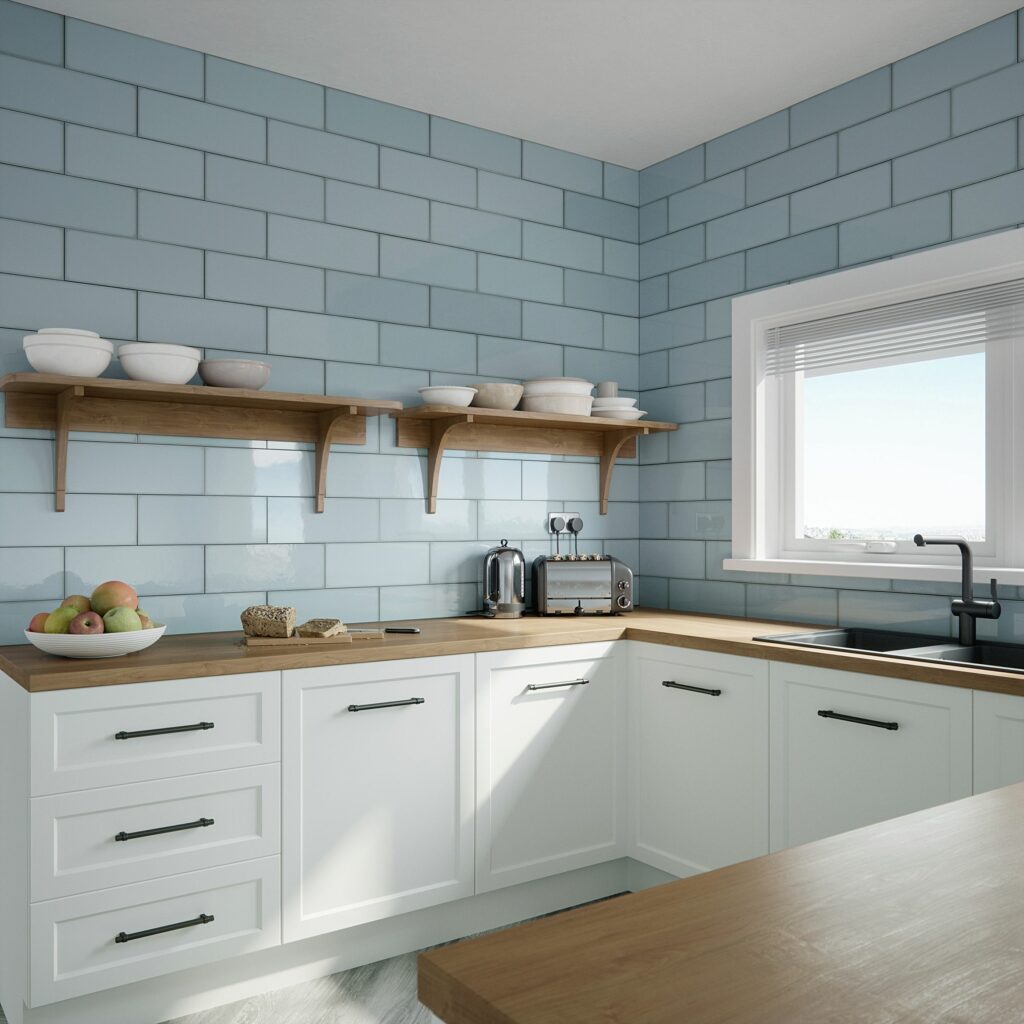
Our Village Blues
So now we’ll bring you some of our blues, which can become part of a Bright Skies™ themed project. Here, our Village Cloud ceramic wall tiles have a high gloss finish and are equally suitable for kitchens, bathrooms and other practical spaces, such as a utility, laundry or boot room. For a spot of extra colour, try some of the shades within the previously mentioned Workshop Palette from Dulux.

For a slightly stronger blue, consider our Village Azure Blue ceramic wall tiles, each measures 200mm x 65mm and have a very slightly textured surface that catches the light in different ways, so the look is lively and interesting. Lots of other colours available, including Teal and Emerald Green.
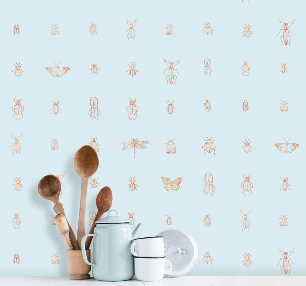
Love Bugs
Get some blue into the kitchen or bathroom with Cleo Sky Blue wallpaper by Elizabeth Ockford, we love all the little bugs, they will definitely add character to a blue room!
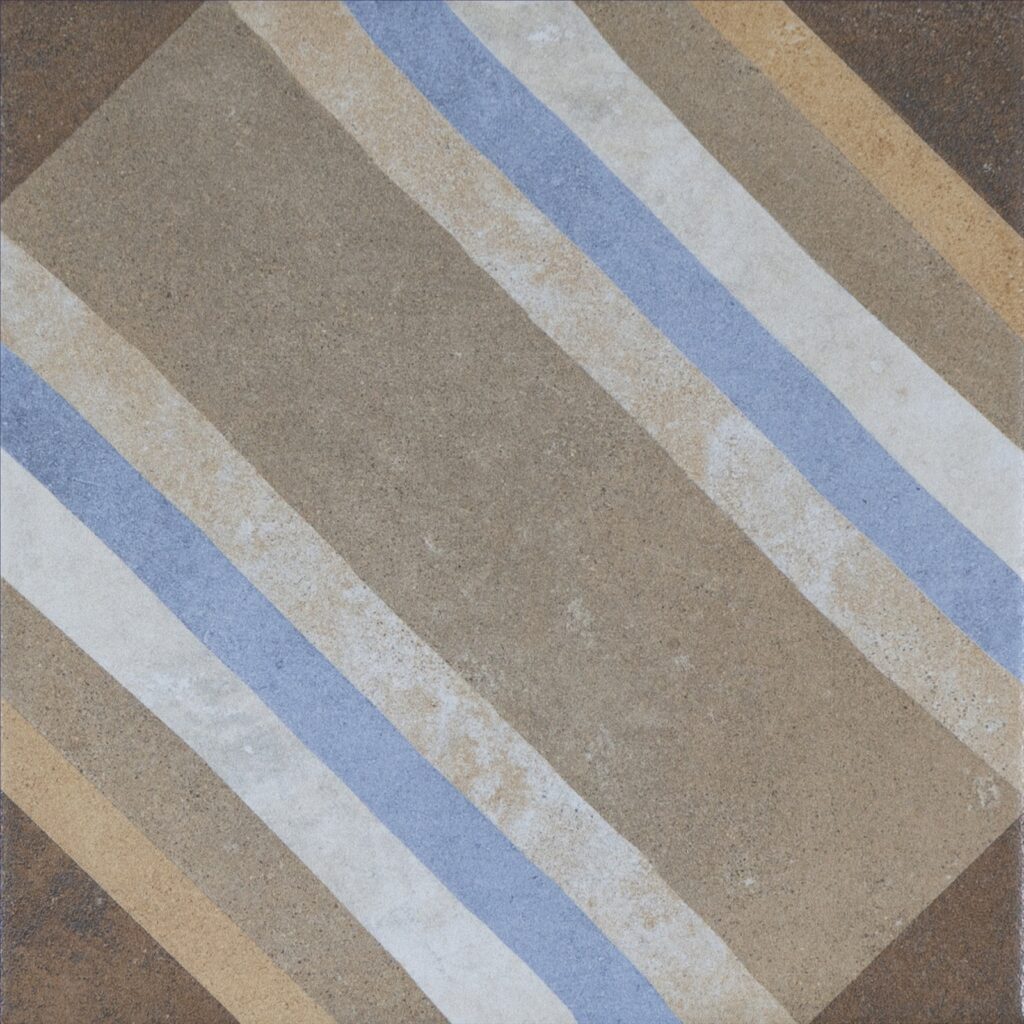
Striped Blues Décor
Add a blue skies element to a neutral flooring (or wall) scheme with our Swing Decor Multicolour porcelain tiles, which are designed to replicate encaustic tiles.
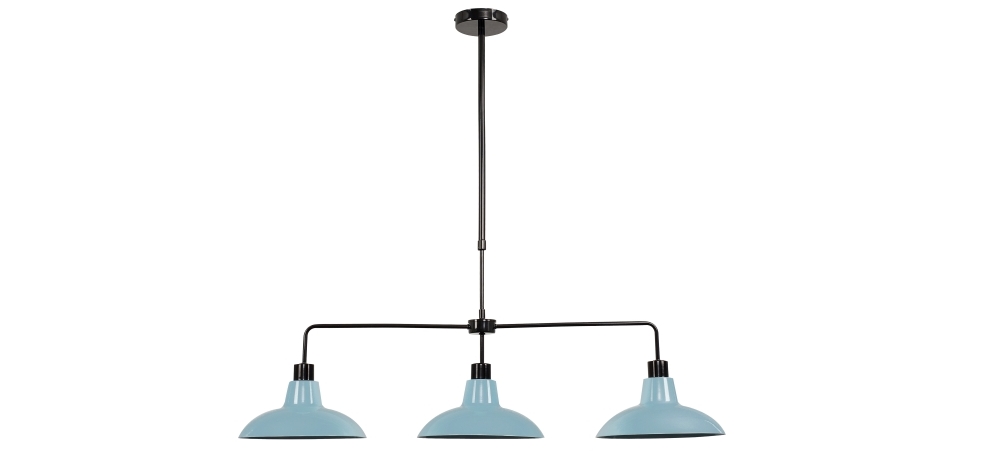
Three Blues in a Row
Add an element of Bright Skies™ to a kitchen scheme with the Huckleberry Over Table Black Ceiling Light with Blue shades, from Iconic Lights. Also available in Cream, Red and Silver.
The Sky’s the Limit
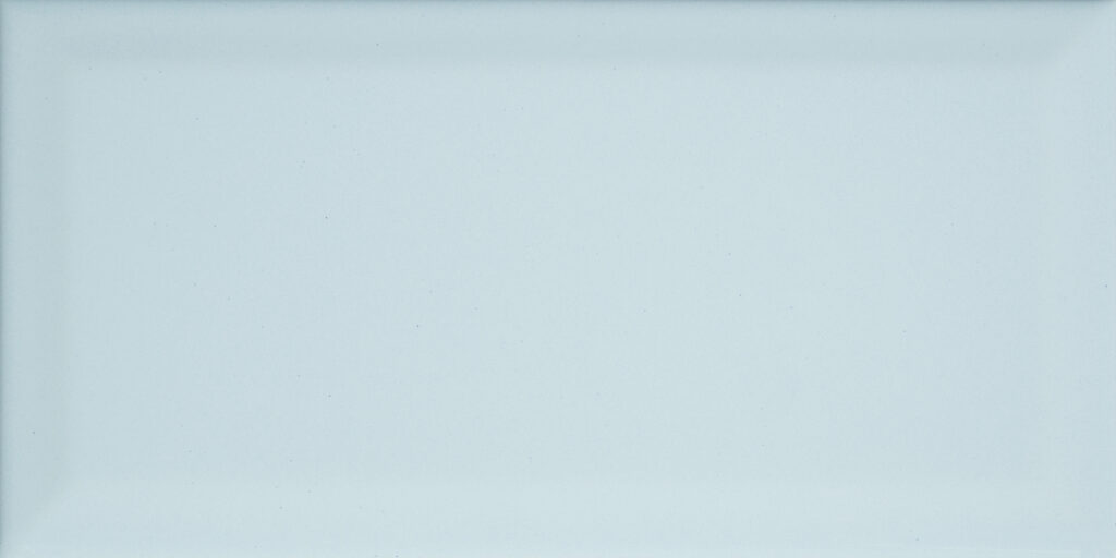
Our Metro tiles come in a variety of colours, including Lime Green, Plum and Black, so there’s something for all colour schemes, whether you want a vivid contrast or a subtle match. Here, of course, we’re focusing on Metro Sky Blue wall tiles to fit in with our Bright Skies™ theme.
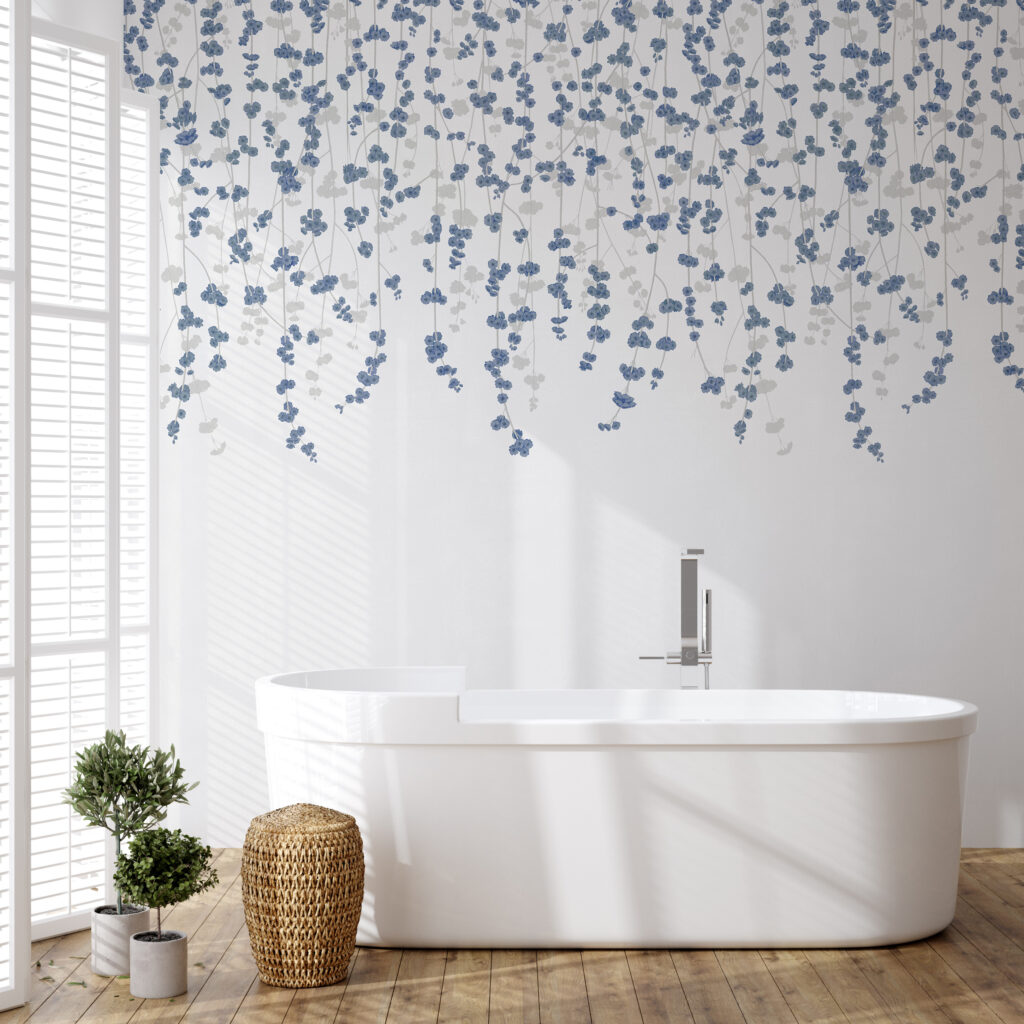
Cherry Blossom Time
A touch of grey and blue livens up this plain, simple and relaxing scheme. White Blue Cherry Blossom Wallpaper from Feathr looks uplifting, teamed with a white bath (for other oval choices take a look at Paddington and Hyde from the freestanding baths collection at our sister company, Bathroom Mountain). And for a fuss-free, easily cleanable and hardwearing wood-look floor, consider our Graziella Roble Oak Wood Effect porcelain planks.
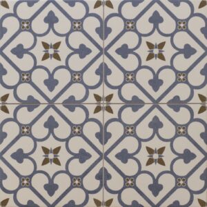
Subtle Blue
As we’ve mentioned before, a multi-coloured floor allows for future changes of colour scheme or additions to the focus shades. Our Brighton Blue Patterned Porcelain Floor Tiles include brown and off-white, allowing plenty of future options.
The Kitchen Blues
Get a slightly retro-look with our Fulham Aqua Wall Tiles; they have that classic Metro styling, but are in a slightly larger format, measuring 400mm x 150mm, in ceramic, with a glossy finish. And also available in , Grey, Blue, Sage and White.
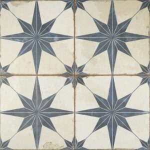
Star Struck!
For a slightly darker shade of blue, try our Metropolis Star Indigo Wall and Floor Tiles, which are ceramic, and which are good choice for a darker focus colour for floor tiles. Also in Black, Sienna, Laurel and Silver.
Have you been inspired to incorporate Blue Skies™ or any of the ideas here into your next renovation project? If so then do send us any pics of your completed projects – hit us up on Twitter tagging @TileMountainUK or on Instagram!
You might also enjoy these posts on the Tile Mountain blog…
Trend Watch: Dulux Announces Spiced Honey as Colour of the Year 2019
Linda has worked as a freelance interiors writer and blogger for many years; she has written for most of the major home and design magazines, including KBB Magazine, Grand Designs, Homes & Gardens, House Beautiful, Period Homes and Good Homes. She made the break and moved from London back to her home town of Shrewsbury three years ago and has just finished renovating her house. She also works in an interior design studio, produces copy for brochures and website, tries to tame her garden, aims to finish all the home furnishing projects she has on the go … and loves walking.