It is not without a certain amount of trepidation that the interior design community awaits the annual announcement for Dulux Colour of the Year 2020. Often signifying the shift in the colours and palettes that will be used in the coming year, this single shade is chosen to embody the nation’s mood on the approach to the new decade.
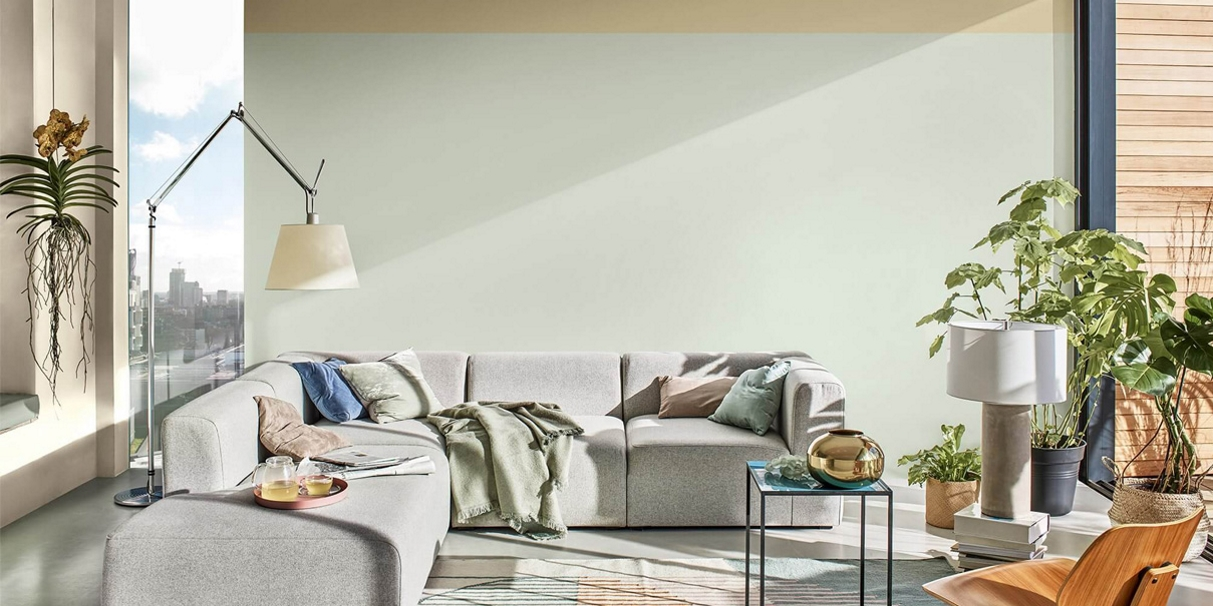
And so it was with some great relief that Dulux’s choice, Tranquil Dawn, was announced and yes, it’s just as lush as it sounds. This soft sage green is calm, bright, easy on the eye and even easier to live with. While last year’s Spiced Honey (a warm golden brown hue) had a more mixed response, there seemed to be few people in the industry who didn’t embrace this hazy pale green tone.
Why Tranquil Dawn?
Dulux revealed that Tranquil Dawn was chosen to reflect ‘a growing desire to understand what it is to be human when advances in technology are making us feel increasingly disconnected from each other.’
Heleen van Gent, Head of AkzoNobel’s Global Aesthetic Centre explained: “At the start of this new decade, the panel identified that the world has a growing desire to understand what makes us human… We need a fresh purpose, to be the architects of our own future and we are asking searching questions of both ourselves and society.”
Marianne Shillingford, Creative Director, Dulux UK said of this year’s colour: “A new decade heralds a new dawn and the hazy pale green tones of Tranquil Dawn are calming and comforting just when we need it most in our lives.”
How is Dulux Colour of the Year Chosen?
The Dulux Colour of the Year 2020 was selected by an expert panel of colour designers, trend forecasters, design specialists, architects and editors from around the world.
Now in its 17th year, the panel – which included former Editor in Chief of Elle Decoration UK, Michelle Ogundehin, and was chaired by Heleen van Gent from AkzoNobel’s Global Aesthetic Centre – identified the nation’s overwhelming desire for reconnection.
How Can You Use Tranquil Dawn in Your Home?
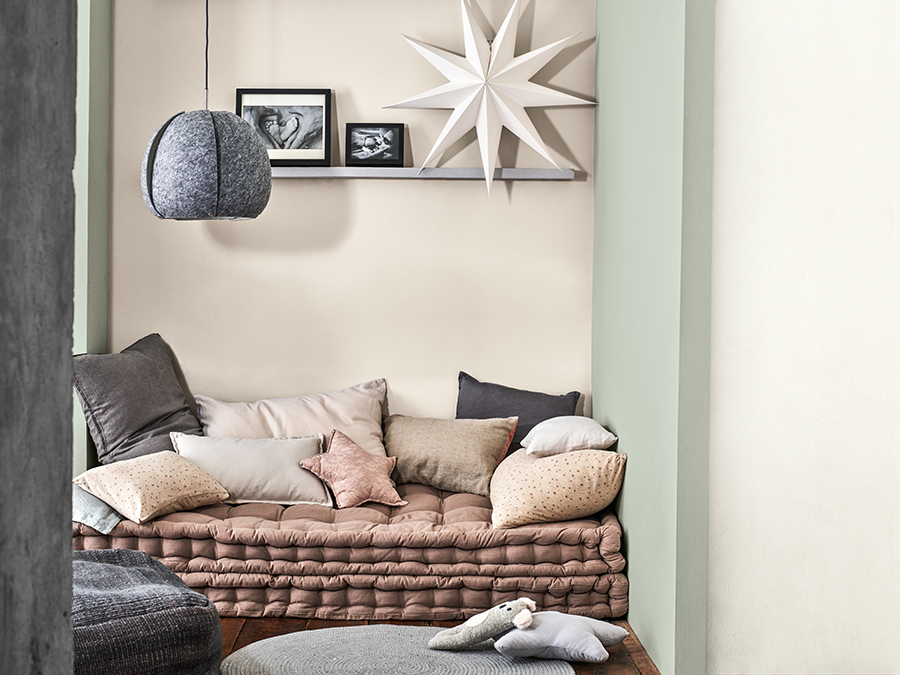
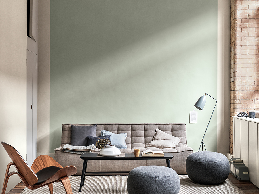
Tranquil Dawn provides a wonderfully calming influence in the home and is, thankfully, incredibly easy to live with. Paired with a neutral pallet, it creates a laid-back warm and easy look but when combined with rich jewel tones or deeper shades, it can be used to offset and ground a more dynamic setting.
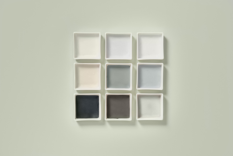
Dulux has also come up with the creation of complementary colour palettes that work beautifully alongside the Colour of the Year, providing inspiration to assist you in incorporating Tranquil Dawn into your home.
Each of these versatile palettes evokes a different feeling and mood for your home simply by the colours Tranquil Dawn is surrounded by.
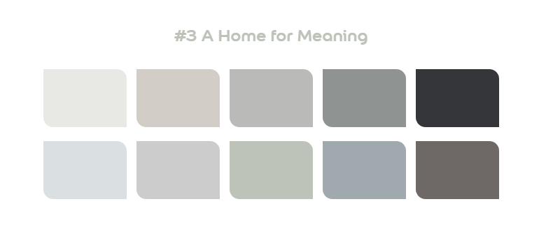
The Meaning Palette is inspired by a cold winter’s dawn. Icy green, warm cream, and charcoal hues combine to provide a feeling of calm and contemplation. Embrace the darker hues of this palette for a moody and relaxing bedroom space or snug or to soften the look of a minimalist dining room.
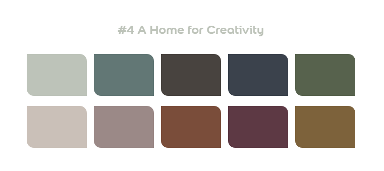
The Creativity Palette is inspired by a warm autumnal day with sumptuous maroon and tobacco hues paired with pale and moss green, the perfect palette for self-expression and storytelling. Perfect for a home office or a family room, bring in sumptuous fabrics and gold metallic finishes for the perfect spot to enjoy together as a family or get lost in your own hobbies.
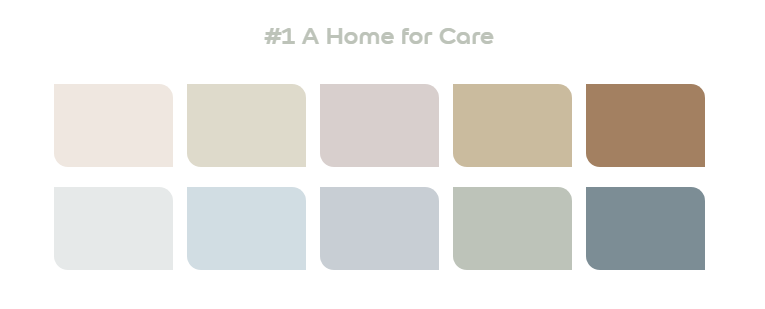
The Care Palette incorporates a blend of earthy neutrals, muted greens, dusty pinks, and smattering of pale blue, all of which are inspired by a hazy spring morning and evoke a feeling of deep relaxation and peace. Consider using this palette for bedrooms as a peaceful sanctuary away from the chaos of the day or for a spa-inspired bathroom. Complete this laid-back look with lush indoor plants and hand-thrown pottery pieces.
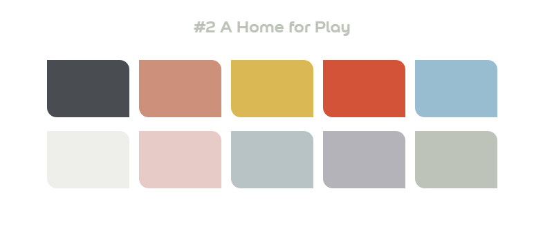 And finally, the Play Palette which is inspired by the horizon of a hot summer morning and features vivid reds contrasted with baby blue, cream, and pale green. Consider choosing this palette for a fun guest bedroom and use alongside white painted furniture, warm wood finishes, and natural textiles.
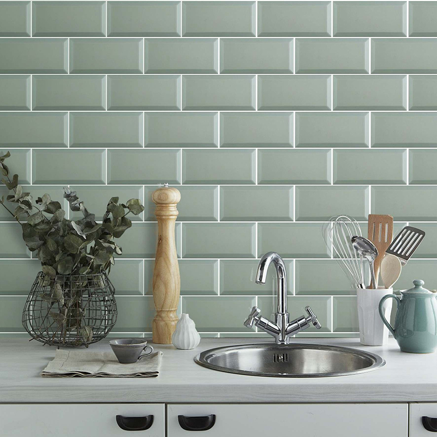
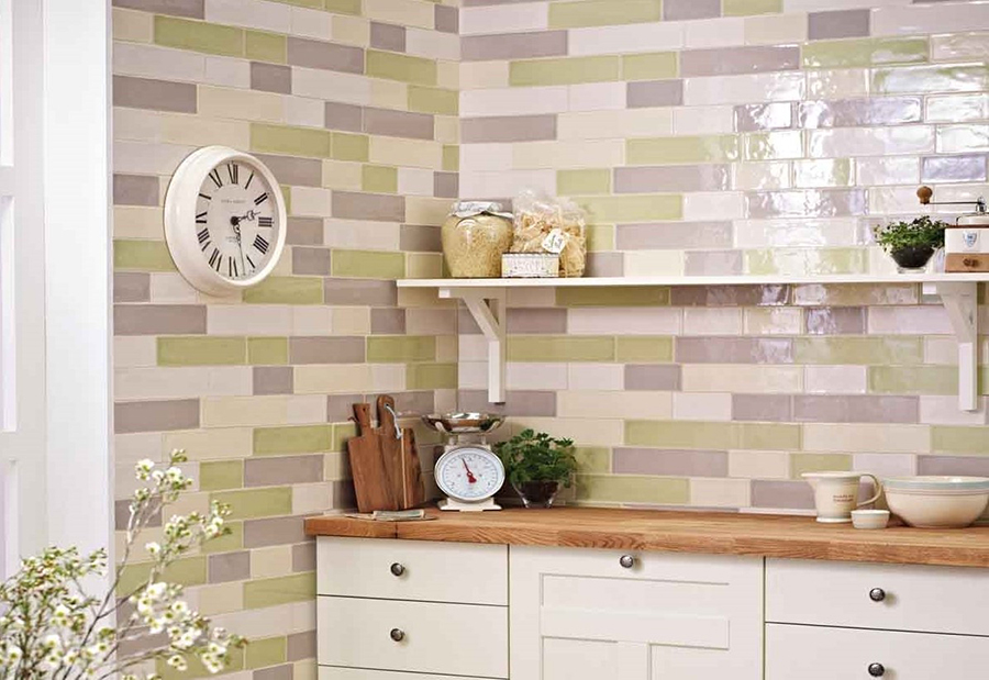
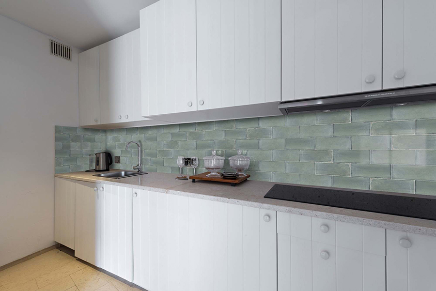
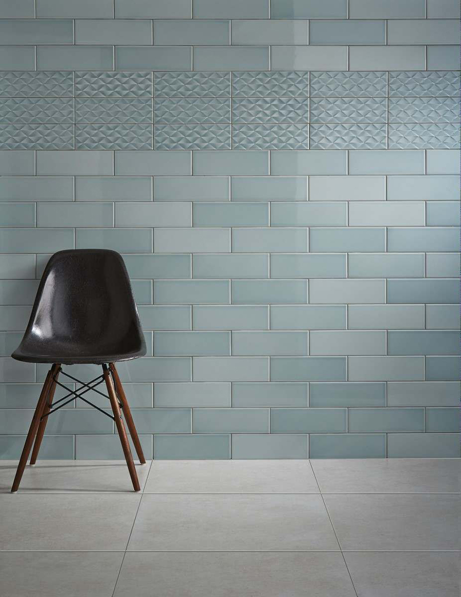
Our Favourite Pale Green Tiles
Inspired by Dulux Colour of the Year, here are our favourite soft green tiles which are a perfect fit for the colour palettes explored above.
What do you think of Tranquil Dawn as Dulux’s Colour of the Year? We’d love to hear if you’ll be using it in your home this year. Be sure to let us know in the comments, tweet us on @TileMountainUK or tag us on Instagram!
You may also enjoy these posts on the Tile Mountain blog:
Trend Watch: Dulux Announces Spiced Honey as Colour of the Year 2019
As a multi-award winning interior design content creator, Kimberly Duran is an Interior Design-obsessed American ex-pat, who chronicles her decorating journey and dispenses interior design advice in her personal blog, Swoon Worthy. When she’s not helplessly drooling over all the latest trends in design, she’s adding things to the imaginary ‘shopping basket’ in her head, she likes to get messy tackling DIY projects with her partner in crime, Wayne, stalking eBay for vintage bargains and filling her home with her favourite neutral – gold.