This instalment of Ultimate Combinations sees us looking at two different ideas – Monochromatic schemes and Vivid schemes. Monochrome schemes are sometimes described as single-colour schemes, but more often we use the term monochrome to describe ‘black and white’ schemes. Combine the two by adding vivid accessories or tiles to a monochrome scheme, or vice-versa, adding monochrome accessories or tiles to an otherwise bright, vivid scheme. Here are some of our suggestions to start you off…
Magically Mono
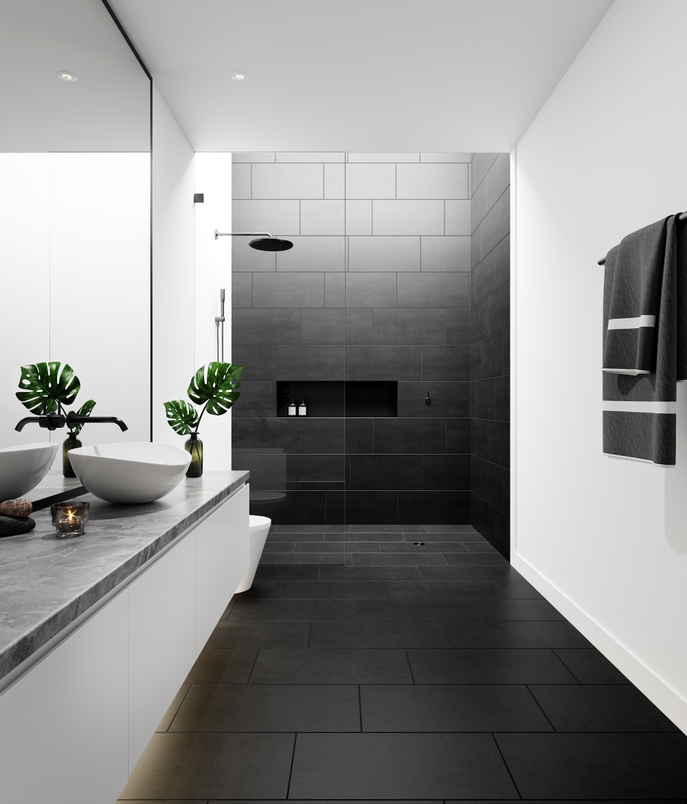
It’s been said many times, and is an integral feature of good of interior design, that sometimes the simplest schemes are the best. This one, using our Lounge Matt Black Porcelain floor tiles, is perfect in it’s laid back simplicity. Porcelain floor tiles are easy to clean and maintain, and in black, reinforce a streamlined, monochromatic look. If you did want to add a minuscule amount of vivid colour, a bright green plant or perhaps a vivid towel, such as the Warner Hand Towel in vivid zig-zag stripes by Missoni from Amara would do the job nicely.
Mono Plus
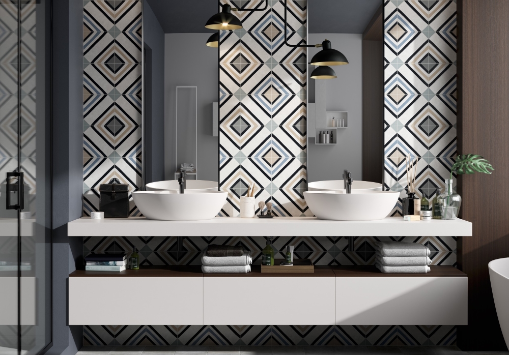
We’re sneaking this one into our monochrome theme, although strictly speaking as the design also has a touch of blue and beige it’s not exactly mono. But it fits into an mono-theme beautifully, with a stylish touch of Art Deco style and an overall black and white feel. These are our latest Swing Decor wall tiles, which are an encaustic-style tile for both walls and floors, in porcelain. There are seven design options altogether – so it’s easy to find something for all schemes.
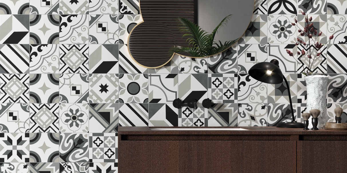
Down To The Details
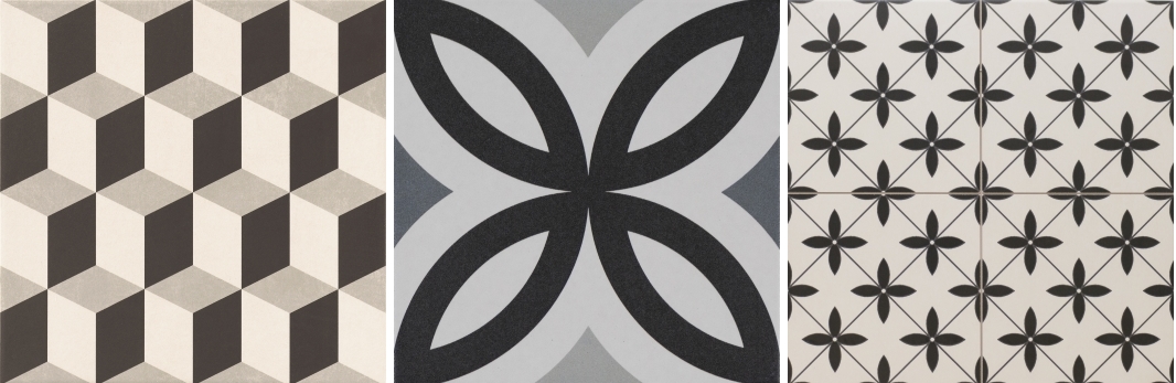
From left; A combination of black, white and grey, such as our Hanoi Cube floor tile has the visual impact of a ‘black and white’ scheme, with the added detail of shadows in grey. Use these for a floor with pristine white walls and perhaps black cabinetry for a kitchen or black wall tiles in a bathroom; Another option from the Swing collection, this design is a classic motif that would add a distinct monochromatic edge to a floor design; As you can see here, our Durham porcelain floor tile with a matt finish can be teamed up with vivid upholstery for a very cheerful look.
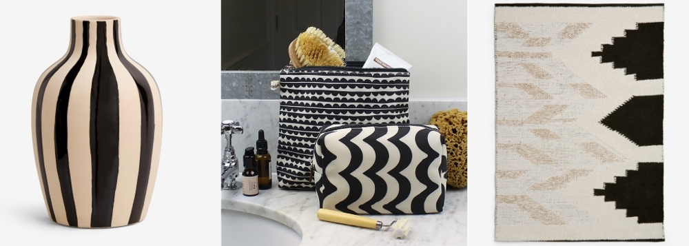
Black and White Striped Vase by Next | Monochromatic Accessories by Brownstone London | Zhara Rug by Next
Add Some Finishing Touches
From left; A black and white striped vase from Next will be an extremely useful addition to your accessories portfolio, and can cover both mono and vivid schemes (just add colourful flowers!); Have a quick browse over at Brownstone London for some very impressive monochromatic accessories…lots of spots, stripes and zig-zag patterns that would look amazing with our monochromatic tiles; Can’t resist this Zhara rug from Next, the geometric design works perfectly with floor tiles, and could bridge that gap between the en-suite bathroom and the bedroom.
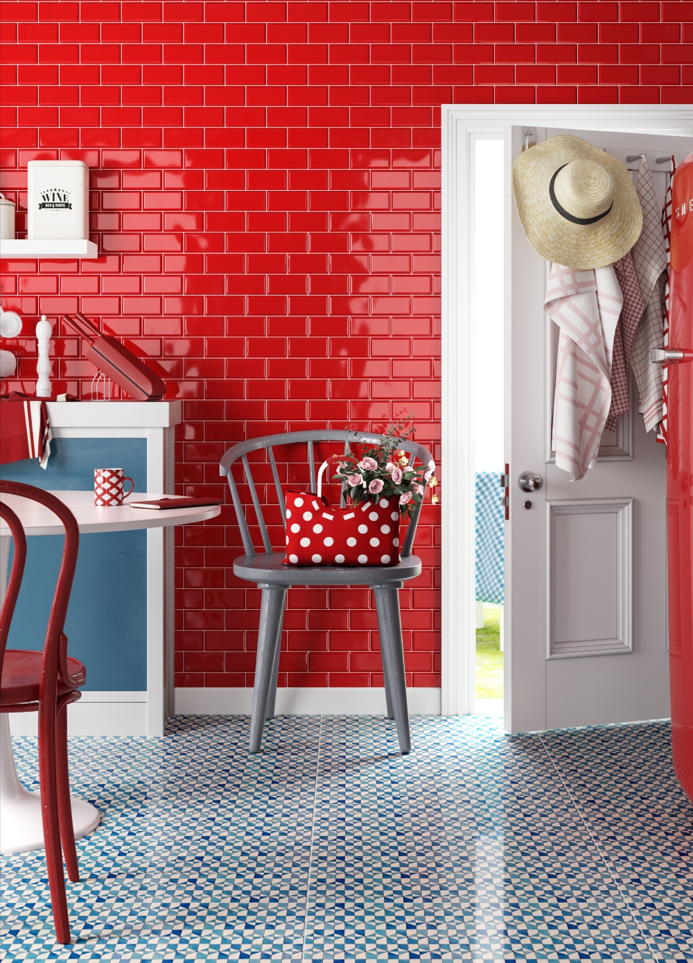
Vividly Red
Most people, when asked to describe a vivid colour, would probably say ‘red’. A splash of red will add a warm, vibrant and exciting theme to an interior design scheme. It’s more of a kitchen colour than a bathroom colour, and if used throughout a whole room – think of a dining room painted in a dark crimson – it can feel intimate and cosy. We love the combination here of our vibrant Metro Red wall tiles, which are available in various size formats.
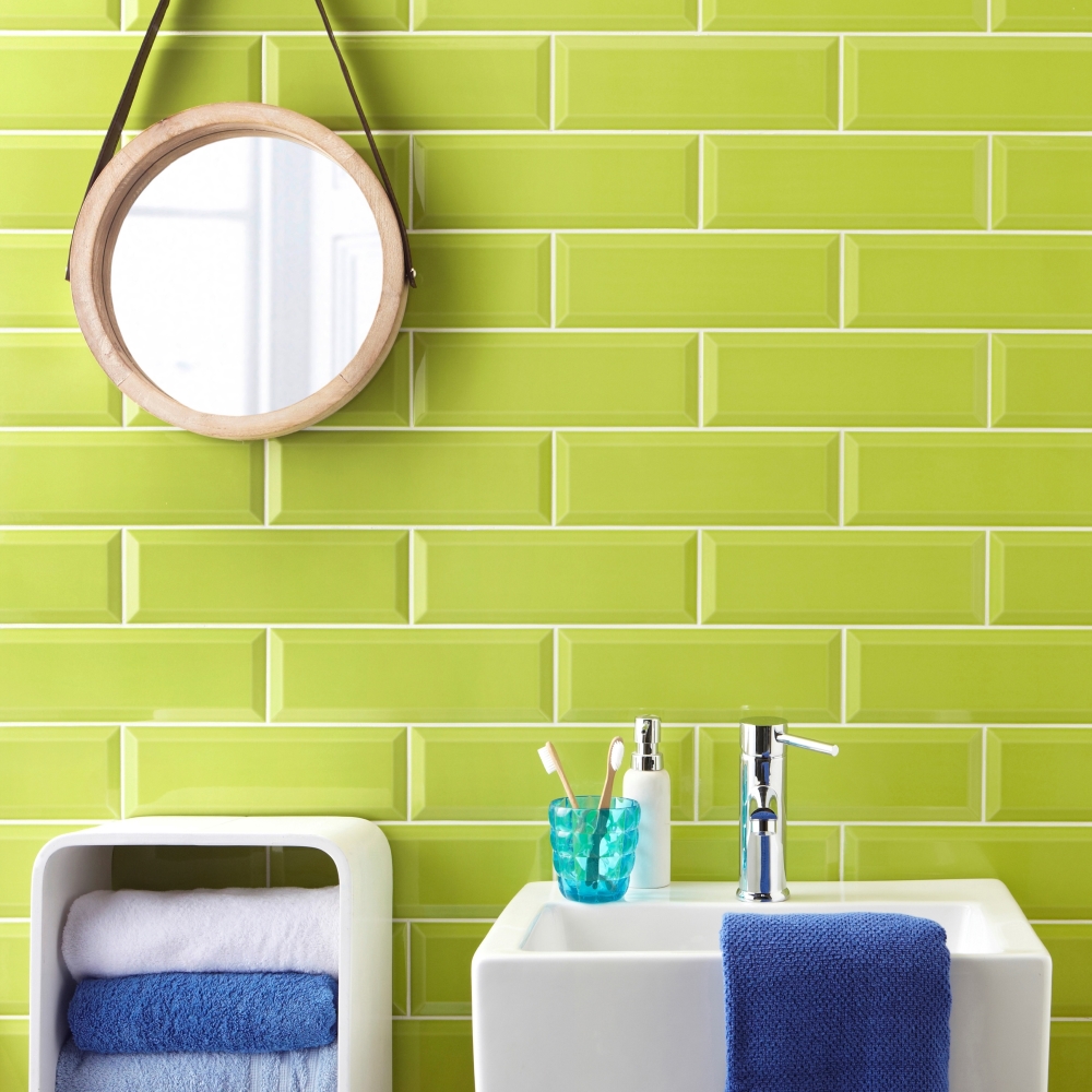
Luscious Lime
Try a splash of lime to add zest to a bathroom or kitchen. We think bright green is a under-used colour at the moment – there are plenty of yellows and mustards around, so perhaps it’s time that lime is due it’s time in the limelight! These are our Metro Lime Green tiles…try them as a splash back or border in a monochromatic scheme as an ultimate combination of mono and vivid.
Contrast Combinations
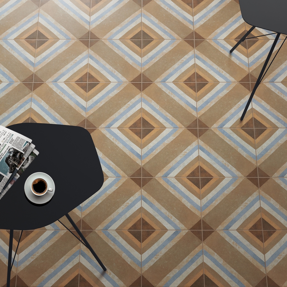
Our Swing Decor Multicolour floor tiles are a little bit of a conundrum… as the colourway includes shades of beige and light blue, they’re not strictly a ‘vivid’ colour choice, yet when contrasted against solid black or white, they do have a beautiful vividness about them – if that makes sense?! Anyway, perhaps we could describe them as ‘vivid neutrals’ instead – they’re far too nice not to include them in this colour-themed story, as the colours used are still strong enough to act as a contrast to black and/or white.
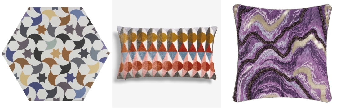
Andalucia Patterned Wall and Floor by Tile Mountain | Jackson Geometric Print Cut Velvet Cushion by Next | Cushion from A by Amara
Very Vivid Additions
Some more vivid shades for your colourful consideration … from left; our very own Andalucia patterned wall and floor tiles, with a collection of 24 colourful, precisely ink-jet printed designs; This Jackson geometric print cut velvet cushion from Next has a glorious combination of elements – both mono and vivid shades are used – in one fell swoop. Result! And last of all, vivid purple is quite the ‘in’ colour at the moment, and once again, we’re thinking it would be a very welcome pop of colour in a monochrome scheme. It’s a new cushion from the latest A by Amara range. Happy shopping and designing!
And remember to send us any shots of your ultimate combinations – hit us up @TileMountainUK or tag us on Instagram with your pics! Next time… we take a deep dive into French farmhouse style, so stand by for a touch of country chic!
You might also enjoy these posts on the Tile Mountain blog…
Linda has worked as a freelance interiors writer and blogger for many years; she has written for most of the major home and design magazines, including KBB Magazine, Grand Designs, Homes & Gardens, House Beautiful, Period Homes and Good Homes. She made the break and moved from London back to her home town of Shrewsbury three years ago and has just finished renovating her house. She also works in an interior design studio, produces copy for brochures and website, tries to tame her garden, aims to finish all the home furnishing projects she has on the go … and loves walking.