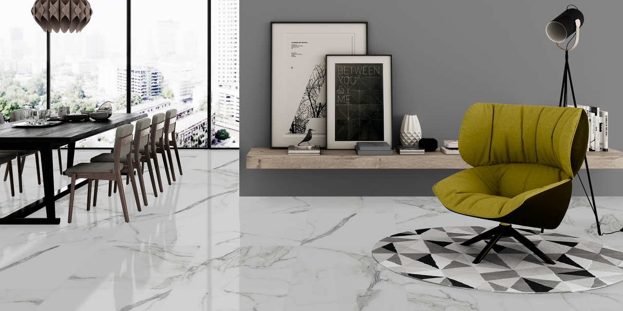
We all want our homes to look spacious, even when they’re not…and one of the simplest ways of adding a lighter, more space-conscious look to a room is to use a very pale floor colour. White tiles are optimal – they are very space-enhancing. Combining pale or white floors with a splash of colour or pattern on the walls is the main focus of this month’s Ultimate Combinations…
Swing Blue Decor | Tile Mountain
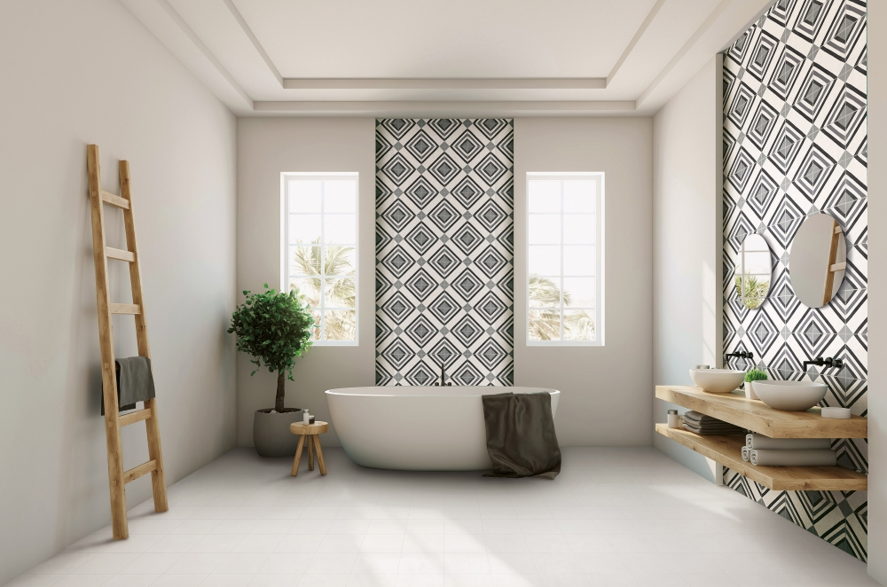
Perfect Patterns
We love the contrasting combinations in this bathroom – strong pattern on the walls and perfectly pale walls and floor. Several design tricks at work here, from the use of patterned tiles (our very own Swing Decor of course!) in panels to highlight the bath and basin areas, rather than covering the whole wall, and the open shelf/basin system that keeps the floor clear of pedestals and floor-standing furniture – contributing greatly to the sense of space and contrast. The floor tiles here are our Swing Ice plain porcelain tiles in very pale beige.
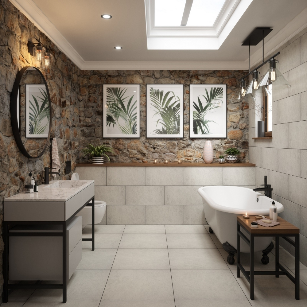
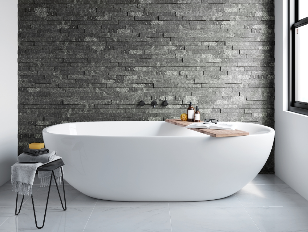
Stone Love
Well, this is a spectacular combination of natural stone walls contrasting with our smooth Quartzite Grey porcelain tiles (available in formats suitable for both walls and floors). These tiles are designed to replicate metamorphic rock, and we love the rectified edges too – which mean that very clean and precise grout lines are achieved. Ok though, you may not have the option to build your country-cottage style real stone wall, but may we suggest some wallpaper options instead for above the dado line? Try this Cornish Stone Pattern Wallpaper instead, from I Want Wallpaper!
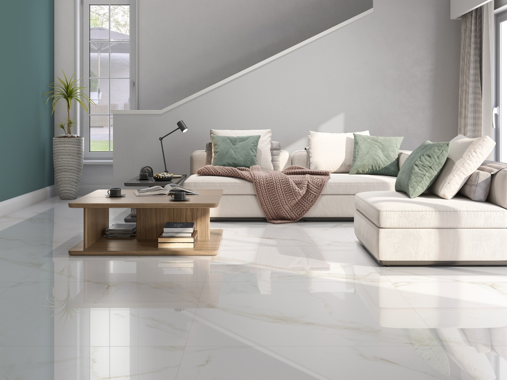
Everything’s Gone Green
Our new Calacatta Gold Gloss marble effect porcelain tiles are a fabulous choice here, the combination of Calacatta for a very pale floor, teamed with pale furniture too is the perfect setting for a couple of splashes of green – for the left hand wall and those cushions. And shhhh… dare we say it, but it won’t be too much trouble to change that colour scheme around in a couple of years be repainting that green wall and adding a few new cushions. For a similar shade of green try Vardo or Arsenic by Farrow & Ball.
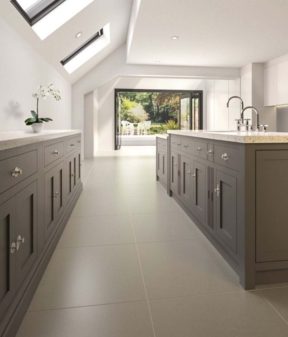
Contrasting Cabinets
Ok, so not quite contrasting walls, per se, but you get the idea. The combination of our beautiful Lounge Ivory Matt porcelain large format tiles with dark painted cabinetry is absolutely gorgeous. Whether you’re combining dark wall tiles, dark paint colours or dark kitchen cabinets with a pale floor you will definitely nail that design concept. Black, navy and forest green are other cabinet colours to consider for a similar combination or theme.
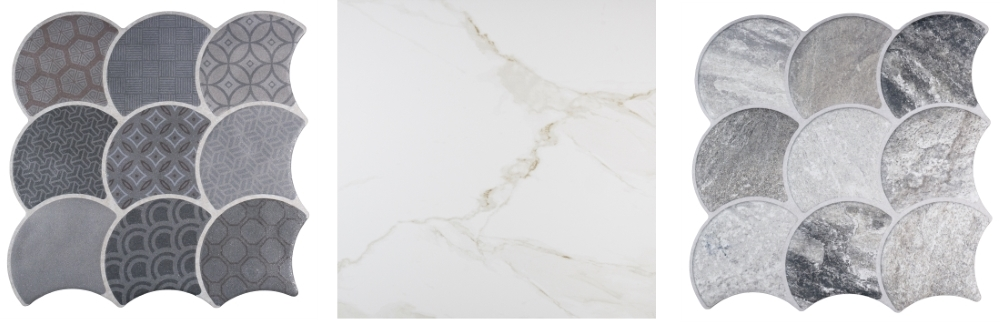
Patterns & Plains
Get a combination of light and dark, colour and pattern into your room schemes with some of our new additions. Left and right, take a look at Scale tiles in four pattern variations, Slate Grey, Stone Steel, Boho Grey and Boho White. And no, you don’t have to fiddle around interlocking curvy tiles together, the interlocking fish-scale pattern is a surface design, and each tile is 307mm x 307mm. A great choice to pair with plain floor tiles for a contrast/combination scheme. And once again, centre, take another close look at our Carrara Gold Gloss Marble effect porcelain tiles to create that pale, glamorous floor.
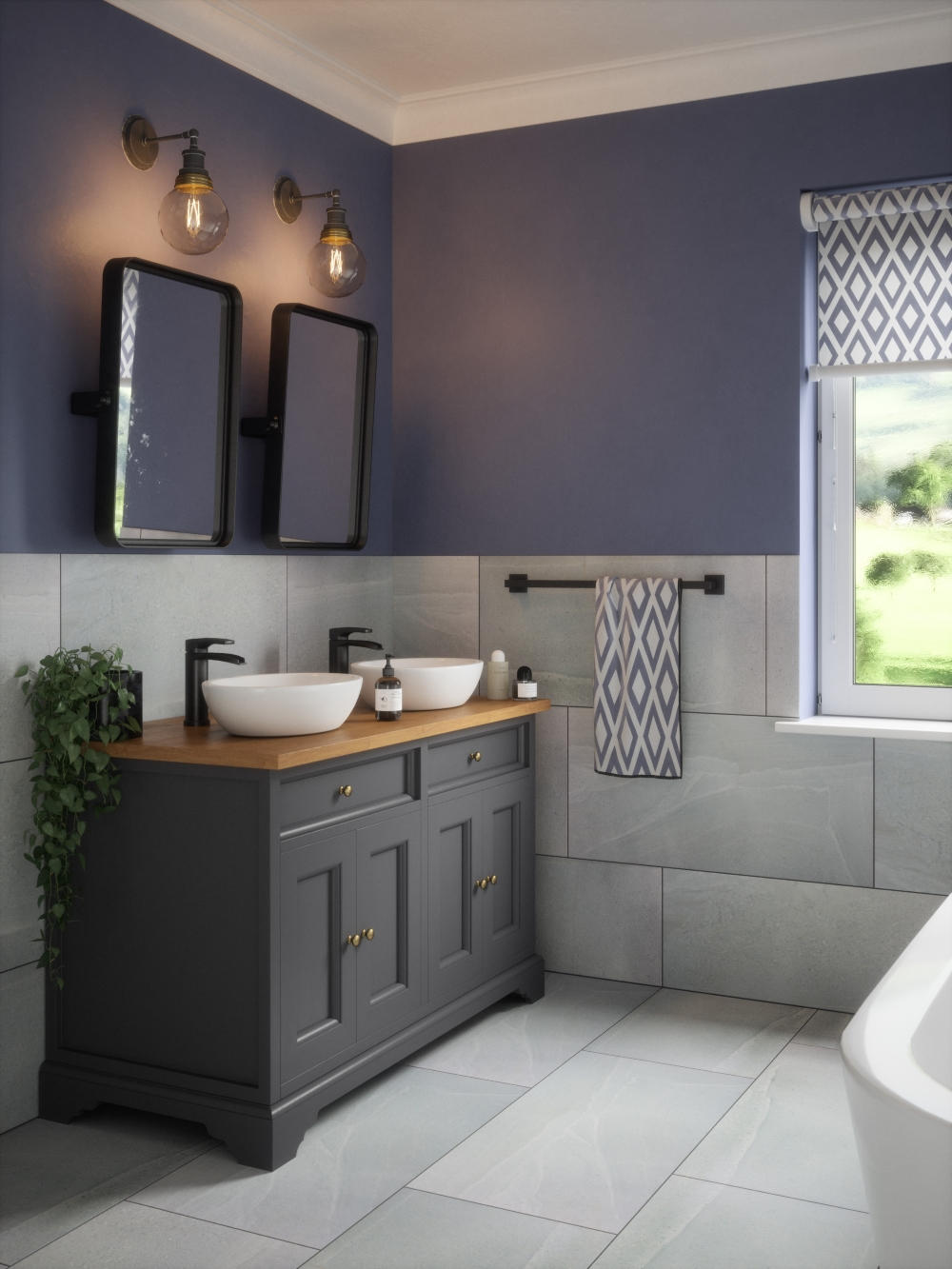
Bold In Blue
Our Grey Stoneline porcelain tiles work for both walls and floors, and are a light enough shade to combine very well indeed with dark walls, in this case, a bold blue. For a similar tone, try Deep Space Blue by Little Greene. We love the design decision here to use a dark charcoal shade for the cabinetry and to emphasise the dark tones with black taps and towel rail. If you’re interested in adding black bathroom accessories to your new bathroom tiling project, take a look at the Matt Black options from Bathroom Mountain.
It’s Black & White…
A favourite, simple and successful combination scheme is very simple. Go for black and white. It’s almost impossible to go wrong with such a scheme, and is very often on our list of ‘Ultimate Combinations’. We consider this to be a perfect example, our Black Split Face Mosaic tiles add interest and texture to a very simple design theme. The floor tiles are Carrara White Gloss Marble effect porcelain tiles.
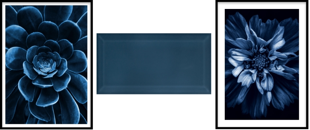
Blue Succulent Poster by Desenio | Metro Atlantis Blue by Tile Mountain | Blue Anemone poster by Desenio
Finishing Touches
Having ended up on a bright blue suggestion, we couldn’t resist giving you a few more blue ideas to finish up your colour schemes! From left; two prints from Desenio, the first is Blue Succulent and the second is Blue Anemone. And of course, we can’t leave a blue theme alone without reminding you of our fabulous Metro Brick tiles in Atlantis Blue.
Will you be bringing a little contrast into your interiors? If so then we would love to see your pics – tweet us on @TileMountainUK, hit us up on Facebook or tag us on Instagram!
You might also like these posts on the Tile Mountain blog…
Ultimate Combinations: Monochromatic and Vivid colour schemes
Linda has worked as a freelance interiors writer and blogger for many years; she has written for most of the major home and design magazines, including KBB Magazine, Grand Designs, Homes & Gardens, House Beautiful, Period Homes and Good Homes. She made the break and moved from London back to her home town of Shrewsbury three years ago and has just finished renovating her house. She also works in an interior design studio, produces copy for brochures and website, tries to tame her garden, aims to finish all the home furnishing projects she has on the go … and loves walking.