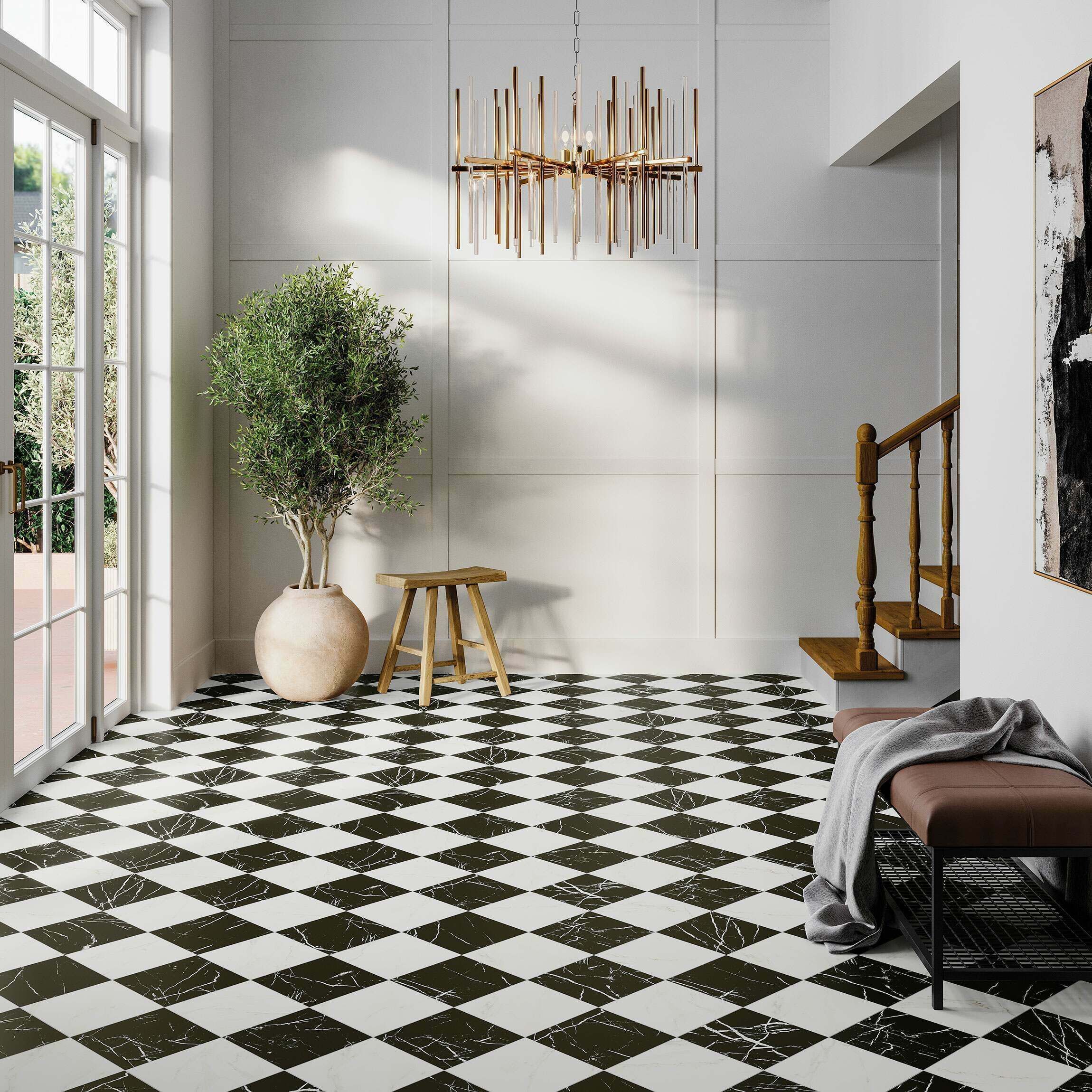
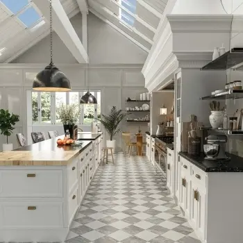
Warm neutral checkerboard tiles are square porcelain tiles laid in two soft, warm-toned colours, such as sand, cream, taupe or biscuit, to form the classic two-tile grid pattern. The look keeps the geometric structure of a traditional chequerboard while replacing stark black-and-white contrast with tonal warmth.
Designers use it in open-plan kitchens, calming bathrooms and period hallways alike. UK search interest for the base term sits above 1,000 searches a month, and demand for softer, tonal versions of the pattern continues to climb alongside it. Explore the full Beige Tiles and Cream Tiles ranges to build the look with Tile Mountain.
Why Is the Warm Neutral Checkerboard Trend Growing in 2026?
The warm neutral checkerboard trend is growing in 2026 because it merges a heritage pattern with the earthy, low-contrast palette leading UK interior design this year. Homeowners want a floor with pattern and character, minus the visual weight of full black-and-white contrast. Two similar-value neutrals create a discreet, textured grid rather than a bold graphic statement.
Sand-and-cream and taupe-and-ivory checkerboards pair naturally with oak furniture, brass fittings and linen textiles, a combination that reads as calm rather than busy. Taupe tiles alone draw over 260 searches a month in the UK, a sign that muted, warm-grey neutrals now compete directly with beige and cream as first-choice tones.
Interior schemes built around warm neutrals also age well. A tonal checkerboard reads as contemporary now and stays relevant as colour trends shift, since its base palette already sits outside any single passing trend cycle.
Which Colour Combinations Work Best for a Warm Neutral Checkerboard?
The 4 leading colour combinations for a warm neutral checkerboard are set out below:
- Sand and cream forms the softest, most versatile pairing, suited to Scandinavian and minimalist schemes.
- Taupe and ivory adds extra depth, suited to hallways and dining rooms.
- Terracotta and biscuit brings Mediterranean warmth, suited to kitchens and covered patios.
- Stone grey and warm white balances cool and warm tones, suited to bathrooms with brass or gold fixtures.
A grout colour matched to the lighter tile keeps the grid seamless, while a mid-tone grout sharpens the pattern’s definition. Combination choice also affects how the floor reads at different times of day: warmer combinations such as terracotta and biscuit hold their tone under artificial light, while cooler pairings like stone grey and warm white shift more noticeably under daylight. Compare exact tones side by side in Beige Floor Tiles and Marble Effect Beige Tiles.
What Tile Size Works Best for a Warm Neutral Checkerboard?
A 300x300mm or 600x600mm square porcelain tile gives a warm neutral checkerboard its clearest, most balanced grid definition. Smaller formats, around 100x100mm to 150x150mm, suit compact areas such as a utility room or a splashback, where a fine, detailed grid fits the scale of the space. Larger formats, from 600x600mm upward, suit open-plan kitchens and living areas, where fewer grout lines create a calmer, more expansive floor.
Matching thickness between the two colours matters as much as matching size. A porcelain tile from the same product range guarantees identical thickness and edge profile, avoiding the lippage, or uneven edges, that occurs when two different tile lines are combined. Buying both colours from the same collection, such as Beige Tiles and Cream Tiles, removes this risk entirely.
Porcelain or Natural Stone Effect: Which Material Suits a Neutral Checkerboard?
Porcelain suits a warm neutral checkerboard floor better than natural stone, because porcelain’s water absorption rate stays below 0.5%, compared to natural stone’s 3% to 7%. Lower water absorption means fewer stains and less resealing over the tile’s lifespan. Porcelain also carries a PEI wear rating of 3 to 5, a scale measuring resistance to surface abrasion, making it suitable for hallways and other high-traffic zones. Stone-effect porcelain, such as the Travertine Effect Tiles range, delivers the visual warmth of natural stone with the practicality of a manufactured tile.
Underfloor heating compatibility favours porcelain too. Porcelain’s dense composition conducts and retains heat evenly, while natural stone’s higher porosity leads to slower, less consistent heat distribution across a checkerboard floor.
Which Grout Colour Works Best for a Warm Neutral Checkerboard?
A grout colour within one or two shades of the lighter tile keeps a warm neutral checkerboard looking seamless, rather than gridded. Sand-and-cream combinations pair well with a warm ivory grout, since a stark white grout creates a colder, more clinical grid line than the tiles themselves suggest. Taupe-and-ivory combinations suit a mid-grey-beige grout, which reads as neutral against both tones rather than favouring one.
Grout width changes the pattern’s visual weight as much as grout colour. A narrow 2mm to 3mm joint keeps the emphasis on the tile colours, while a wider 4mm to 5mm joint, in a contrasting grout, sharpens the grid and pushes the look toward a more traditional, higher-contrast chequerboard.
Which Rooms Suit Warm Neutral Checkerboard Tiles?
Warm neutral checkerboard tiles suit 4 room types particularly well:
- Kitchens gain a textured floor that hides everyday marks, especially in sand or taupe tones. Pair Cream Kitchen Floor Tiles with Beige Kitchen Wall Tiles for a coordinated scheme.
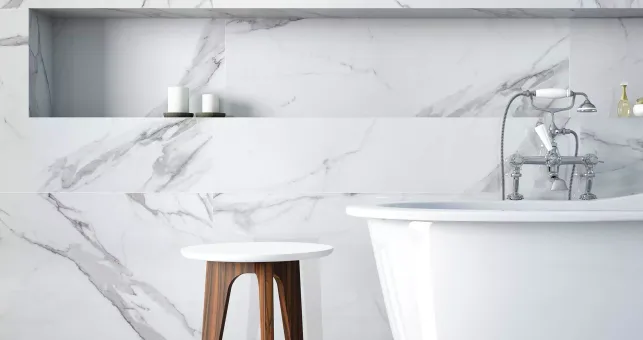
- Bathrooms feel calmer under a tonal grid than under a high-contrast pattern. Pair Cream Bathroom Tiles with Beige Bathroom Wall Tiles for matching walls and floors.
- Hallways carry the pattern’s period roots best, echoing traditional Victorian Tiles entrance floors without the stark monochrome.
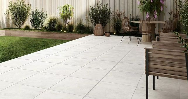
- Outdoor patios benefit from a frost-proof porcelain checkerboard in terracotta or sand tones. Beige Outdoor Tiles and Outdoor Porcelain Tiles both carry exterior-rated finishes.
Room size also guides the layout decision. A large kitchen or open-plan space carries a straight grid comfortably, while a small bathroom or downstairs cloakroom often benefits more from a diagonal layout, which visually stretches the floor toward the corners of the room.
Lighting conditions shift the recommendation further. A north-facing kitchen with limited natural light suits a lighter combination, such as cream and warm white, since darker neutrals like taupe absorb more of the available light and make the room feel smaller. A bright, south-facing hallway carries a deeper combination, such as taupe and biscuit, without losing warmth.
Is a Warm Neutral Checkerboard a Trend or a Timeless Classic?
A warm neutral checkerboard sits closer to a timeless classic than a passing trend, since the underlying chequerboard pattern has appeared in interiors for over 300 years. The 2026 shift toward tonal, warm-toned pairings updates the palette rather than the pattern itself, a distinction that matters for anyone weighing up a full floor replacement. A bold black-and-white version of the pattern dates a room to whichever decade favoured strong contrast, while a sand-and-cream or taupe-and-ivory version sits comfortably alongside whatever colour scheme follows.
This distinction also affects resale value. A neutral-toned pattern floor reads as a considered design choice to most buyers, rather than a strong personal statement that a new owner has to work around, which keeps a warm neutral checkerboard a safer long-term investment than a high-contrast version of the same layout.
How Do You Lay a Warm Neutral Checkerboard Pattern?
A warm neutral checkerboard pattern uses a 50/50 grid of two same-size square tiles, laid straight for a classic grid or turned 45 degrees for a diamond effect. Layout changes the room’s apparent proportions, so it pays to plan the direction before ordering. The table below compares three common layouts by visual effect and best-suited room:
| Layout | Visual Effect | Best Suited To |
|---|---|---|
| Straight grid | Calm, structured, traditional | Kitchens, hallways |
| 45-degree diamond | Dynamic, space-elongating | Narrow hallways, small bathrooms |
| Border-framed grid | Defined, formal | Period entrances, dining rooms |
A 300x300mm or 600x600mm format gives the clearest grid definition. 3 free cut samples of each colour, ordered ahead of time, let the tones get checked together under a room’s actual lighting, since sand and cream tones in particular shift under warm versus cool bulbs.
Which Tile Mountain Tiles Create a Warm Neutral Checkerboard Look?
Clay Chequer Sand delivers the most direct warm neutral checkerboard look at Tile Mountain, combining a sand-and-cream grid pattern within a single porcelain tile. Clay Chequer Sand sits within the same collection as Clay Chequer Silver, a cooler-toned option for a more graphic finish, and Clay Cocoa, a distressed wall tile from the same range suited to a coordinated splashback or feature wall.
A bespoke two-tone grid is also achievable by pairing two single-colour porcelain tiles from the Beige Tiles and Cream Tiles ranges, matched by size and finish for a seamless join. Titanio Beige Floor Tile offers three coordinating neutral colourways in one range, a practical starting point for buyers who want the wall and floor to share the same tonal family. Retro Tiles and Victorian Tiles offer further pattern inspiration for period properties.
What Mistakes Should You Avoid With a Warm Neutral Checkerboard Floor?
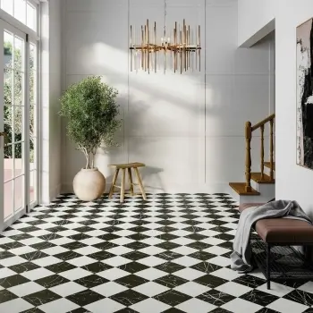
The most common mistake with a warm neutral checkerboard floor is pairing two tiles with too little tonal contrast, so the grid pattern disappears entirely once grouted. A minimum contrast gap between the two colours keeps the pattern visible without tipping into a high-contrast, traditional black-and-white look. Mixing a matt tile with a gloss tile in the same checkerboard is a second common mistake, since the different light reflection between the two finishes draws more attention than the colour difference itself.
A third mistake is choosing an indoor-only tile for a covered outdoor space. Checkerboard tiles destined for a patio or porch need a slip-resistance rating of R10 or higher and a frost-proof porcelain body, regardless of how well the indoor colourway matches the rest of the scheme.
How Do You Maintain Warm Neutral Checkerboard Tiles?
Warm neutral checkerboard tiles stay clean with a weekly sweep and a pH-neutral cleaner, and porcelain skips specialist stone-care products entirely. Prompt wiping of spills on the lighter tone prevents staining at the grout line. A natural stone-effect finish benefits from an annual reseal, while a full porcelain checkerboard never needs sealing at all. A mid-tone sanded grout keeps a sand-and-cream floor looking cleanest for longer, compared with a stark white grout.
Frequently Asked Questions
Is a chequerboard the same as a checkerboard?
Chequerboard and checkerboard describe the identical two-tone grid pattern, with chequerboard the standard British spelling and checkerboard the American spelling.
Are checkerboard tiles a good choice for a kitchen floor?
Checkerboard tiles suit a kitchen floor well, since a porcelain grid in sand, taupe or biscuit tones hides everyday marks and withstands daily foot traffic and spills.
Do checkerboard tiles work in a small bathroom?
A checkerboard pattern works in a small bathroom when laid in two close-tone neutrals on a small tile format, or turned 45 degrees to visually stretch the floor toward the walls.
Can checkerboard tiles be used outdoors?
Frost-proof porcelain checkerboard tiles suit outdoor patios and pathways, provided the chosen range carries an R10 or higher slip-resistance rating and a manufacturer guarantee for exterior use.
What colours pair well with taupe checkerboard tiles?
Taupe checkerboard tiles pair well with ivory, warm white and soft sand, three tones close enough in value to keep the grid subtle rather than high-contrast.
Is porcelain or marble better for a checkerboard floor?
Porcelain outperforms marble for a checkerboard floor on cost, water absorption and maintenance, while marble and marble-effect porcelain, such as the Marble Chess Effect Black & White Matt Porcelain Tile, suits buyers prioritising a higher-contrast, veined finish.
Is checkerboard a period or Victorian design?
Checkerboard flooring originates in Victorian and Georgian entrance halls, and the pattern continues in a softer, warm-neutral form in contemporary 2026 interiors.
Summing Up
Warm neutral checkerboard tiles give a period-classic pattern a soft, contemporary update for 2026, trading stark black-and-white contrast for sand, cream, taupe and biscuit tones that suit kitchens, bathrooms, hallways and outdoor spaces alike.
Getting the look right comes down to 3 decisions: a colour pairing with just enough tonal contrast, a porcelain tile in a consistent size and finish, and a grout choice that supports rather than fights the palette. Browse the full All Tiles Collection, order 3 free cut samples, and get fast, free UK delivery on orders over £299.

Here at Tile Mountain, we not only have a huge range of tiles to suit every purpose, we also have a wealth of tiling knowledge gained from over 30 years in the tile industry, (which we’ll do or best to share with you across these very pages).
Whether you’re looking for the perfect tiles for your next home improvement project, are searching for some style inspiration, or simply need a bit of help and advice, you’re in the right place.